102. The Experience
"This is the biggest shift in Windows…" —Walt Mossberg to Julie Larson-Green during an on-stage demonstration of Windows 8, June, 2011.
A challenge that comes with writing down experiences occurs when writing about events that readers lived through, have strong opinions about, and feel they know the full story. My purpose here is to share what we were thinking and doing at the time, how a broad set of people reacted, and then to offer my views of the reasons leading to the results. That is a way of saying this section is going to start with what we set out to do, not where we ended.
Back to 101. Reimagining Windows from the Chipset to the Experience: The Chipset [Ch. XV]
We set out to reimagine Windows, but it is interesting to ask what exactly the product is to most people. This helps us to understand the thoughts behind making a major change. We saw this in the changes to Office—we recognized the value of Office was not as many might have thought, the file formats or the old File|Edit|View|Tools|Window|Help menu structure, but rather the inherent capabilities and implementation of those capabilities. In that spirit, we looked at Windows and saw much more than the specifics of the Start menu or any particular expression of a user interface. Windows at its core proved to be a remarkably resilient operating system and our goal was to tap that resiliency to bring it new capabilities for a new world of customers.
Fundamentally an operating system can be thought of as the software that allocates hardware resources, manages connectivity and devices, and defines the human to device interaction model. Beyond these technology distinctions Windows is also a culture of openness to developers and an ecosystem of partners that itself has proven resilient over time. Windows is no more one of those than a single feature or attribute above others.
As both a participant in and later a contributor to the evolution of Windows, I find the transitions that the Windows product has gone through to be a case study in the “soft” part of software and in the flexibility of the product team to engineer transitions from one evolutionary stage to another. Consider just some of the transitions the Windows OS kernel or core operating system have undergone:
GUI transition. Windows itself was the product of a transition that many doubted could be made. Could an entire OS be built upon the "shaky" underpinnings of MS-DOS in the face of Macintosh? A remarkable amount of work went into the technology across the ecosystem, such support for 32-bit microprocessors, that made Windows 3.0 such a watershed product. Yet underlying that, customers could still bring forward investments in all those applications and peripherals from MS-DOS.
32-bit transition. The transition to 32-bits was one that required a vast amount of change and brought with it the introduction of "plug and play" and the ability to run more sophisticated graphical applications and games of unrivaled qualities. The introduction of Windows 95 was a watershed moment for the whole industry. While in hindsight it looks as though it was a sure thing, many at the time proclaimed it would be technically impossible.
Internet transition. Immediately after the release of Windows 95, the conventional wisdom quickly became that Windows would be replaced by a browser. Yet few would have argued with the fact that the presence of Windows—the support for networking, the introduction of graphical web browsers on Windows, as well as the openness of the platform all contributed to the transformation of the world of information technology. In 2010 we were just starting to see how the powerful graphics of Windows could bring standards based HTML5 to life in unprecedented ways. As we will see in the next section, the programming model and API of Windows was indeed still struggling.
Server Scale. As we continued to evolve the client (workstation) OS we were using this same OS foundation to power the datacenter. With Windows Server we scaled the OS to support hundreds of computing cores and terabytes of storage. And along the way we created this OS for multiple CPU architectures driven by the demands of server computing (Alpha, MIPS, Itanium, and 64-bit). At each step most people believed that such flexibility was neither prudent nor possible.
Security and Reliability. Through the above transitions, there was an undercurrent that Windows was "aging" and that it could not transition to modern computing needs of much larger memory architectures, multi-core OS support, improved reliability, and much better security. The introduction of Windows XP was a milestone in bringing our enterprise server and workstation OS to mainstream consumers. Ironically, at the introduction of Windows XP many thought we had reached too far, and that the OS was more than people would need or could even afford to power. Throughout this transition the introduction of Windows Update enabled the OS to stay connected to customers, provide code updates, and distribute software on behalf of the ecosystem.
These transitions were supported by consistently strong engineering efforts to refactor, rearchitect, and re-tune the Windows operating system. Windows also showed a broad set of efforts at the experience or user interface layer in the system as well. The various editions of including Windows Home, Windows Professional, and Windows Enterprise while often viewed as pricing and licensing efforts did in practice introduce a wide range of functionality tuned to different customer segments. Windows was able to reach up and down in complexity using the resiliency and flexibility inherent in the architecture.
Yet, at the experience level Windows also struggled to achieve critical mass in several important areas even with the capabilities of the team and assets in the code. In Hardcore Software, we’ve seen the difficulties of creating tablet computers (Tablet PC), handheld computers (Windows CE), home entertainment (Windows Media Center), industrial devices (Windows Embedded), and most recently the ongoing development of smartphones (Windows Phone 7.)
What is it about the experience layer that has proved so difficult for Microsoft? There could be many possible explanations. Was Microsoft too early when it should have been patient? Was Windows code simply the wrong starting point? Did we bring out good products but had inferior marketing, sales, and distribution? Some would point to one of more of these.
I had my own theory and plan for trying something different.
My view was that Microsoft relied too heavily on the notion of architectural layering and believed that experience could always be layered “on top” of the operating system. This computer science view drove nearly every discussion on how things should move forward. It was viewed as they key to architecting Windows for these different experiences while maintaining the shared code of the actual operating system.
Microsoft systems culture (aka BillG) loved to believe that with the right architecture things in one layer could advance independent of another. I don’t think I could begin to enumerate all the times we debated issues that boiled down to me suggesting the abstractions are in the way while Bill insisted that great architecture would solve the problem. The counter was that I was failing to consider building a great architecture before addressing the problem. I was merely suggesting that we might end up spending 90% of the time on 10% of the problem.
In my heart I am an “apps person” as I’ve noted many times. One thing that is conceptually different about apps from operating systems is that apps tend to be much less hardcore (or religious as some might say) about architectural layers while much more zealous about solving the customer problem even if that means breaking through well-considered abstraction layers. In an operating system there’s a general tendency to view the layers and architecture as goals the system must achieve and moving forward the layers enable advances and are deeply respected. Whereas in apps the layers and architecture tend to be the starting point while innovation and moving forward usually involve breaking those very abstractions.
Each of the above attempts at expanding the experience of Windows were implemented with the explicit goal and architectural starting point of not interfering with the core of Windows. Importantly, the teams executed without organizational alignment across the Windows team or schedule. The essence of the former COSD division was to serve the main missions of Windows for desktops and for servers but generally favored the server mission for cultural and historic reasons. Whereas the Client division served the multiple experiences of Windows but did not generally prioritize experiences beyond the main client. To be clear I am not saying this was wrong at the time, rather it introduced tradeoffs that had side effects relative to other missions.
This to me was the kind of decision made early in a project that is difficult to work around. The inability of the Tablet PC to fully embrace native Windows implementations or for Windows Phone to tap into the available power of the Windows operating system support for devices and connectivity were examples I’d personally experienced. As an apps person in the “two gardens” sense, the same way we needed Word and Excel to share code and align around everything from the use of the Windows registry to HTML to drawing code to user interface, we needed Windows to align around these expansions and changes to the experience.
Windows was making a tradeoff at each of the junctures. There were two higher priority advances that needed to happen. First the work to transition from MS-DOS and 16-bit Windows to the full 32-bit operating system was an imperative that could not be compromised. Second, the need to continue to scale Windows up for the data center and to have a consistent client-server operating system was architecturally key. These were long term goals that were put in place and executed over at least two decades as discussed in 011. A Strategy for the ‘90s: Windows.
By 2010 we had achieved those goals. The achievement of those goals came, arguably, at the expense of losing out on tablets, phone, internet-scale cloud, and embedded devices of all kinds. Further, as we will see in the next chapter, we failed to align significantly in our developer tools and messaging about the Windows experience platform, further weakening our strategy vis-à-vis these new opportunities for software and devices.
When announcing the transition Windows was making to support SoC and ARM the resiliency of Windows was top of mind. So much so that the working name of the event was titled around “resiliency” and that was the script I prepared though that was rightly deemed defensive.
The event stopped at the chip layer, intentionally. I knew the history and what we had been deliberate about in planning Windows 8. Windows 8 was not going to simply stick to the architectural layers that were in place. This transition was much bigger and needed a holistic and consistent approach up and down the layers. We were specifically not going to bolt a new experience on top of Windows any more than Windows 95 bolted a GUI on top of MS-DOS as some might have said we did. If all we did was port Windows to ARM, then literally nothing would have changed, and the outcome would have been no better than porting to DEC Alpha or MIPS.
For Windows 8 to succeed and reimagining Windows for a new era we would need to have a new experience that matched a new operating system kernel combined with new capabilities for partners and developers.
With that goal in mind, we set out to rethink the computer that we all used each day. We intended to build on the resiliency of Windows, not to simply go all in on tablets, but to support the attributes customers were already seeing in tablets and smartphones with a wide variety of computers of all shapes and sizes. This was not a fantasy or a “leverage Windows” approach lacking in engineering reality. In fact, it was exactly what Apple did to bring the iPhone and then iPad to market, building on the resiliency of their approach only with a much more explicit end-to-end implementation. Apple even had a server product just as Microsoft did, though ceased to offer it as a separate product in 2011. Android did not take this fully integrated approach to the operating system and scenarios and the result we were seeing in market was showing the weaknesses of Android when it came to customer experience across different devices.
While there was no escaping the tablet focus of the world beyond our hallways, our goal for Windows was to embrace new paradigms and bring Windows forward. Even at the unveiling of support for ARM, we tried to be clear that we saw a convergence of devices not a distinct world of devices, no matter how much they might work together. Whereas Steve Jobs claimed that the iPad was an in between a phone and a Mac and had something special to do, we saw devices as a continuum. Specifically, Apple saw three discrete devices and we believed that the tablet and the PC could be a single device, a new kind of device. We didn’t see this as a hybrid or an inefficient bundle, but engineering and design problems to be solved.
Where Apple, even to this day, sees as laptop as something without touch capabilities and a tablet as something with less than optimal “multi-tasking,” we saw devices as sharing metaphors and paradigms the way we saw desktops and servers successfully sharing paradigms. I viewed Apple’s line in the sand about the iPad as stubborn, especially considering the role of something as obvious as a keyboard, never mind plugging in a USB drive or external camera. Apple did not even introduce their own keyboard for the iPad until 2015 and a trackpad came in 2020.
As I said, though in not so many words, at the CES 2011 event; the advantages Windows provided are the ones that have brought success and customers to so many:
Broad opportunities for developers
Openness of the software platform
Breadth of devices and peripherals
These continued to be the hallmarks of Windows as we designed the Windows 8 experience.
The Windows 8 Experience
Previously when describing the Office 2007 user experience, I shared that the team had developed a set of tools supported by a set of principles, rather than simply coming up with new variants of the various widgets. The Windows 8 program management team, again led by Jensen Harris (JensenH) reporting to Julie Larson-Green (JulieLar) took this same approach. Sam Moreau (SMoreau) led the Windows design team joined by the incredible Clay Satterfield (ClaySatt) who had worked on the Ribbon with Jensen, and Jeff Johnson (JeffJo) led the software development team. Given the breadth of this effort it feels awkward to call out only a few, but at the same time these members of the team were the force behind the work.
When something new is introduced as a replacement for a standard, there’s a tendency to look at what is different and to believe in a “whole new cloth” approach to design. Very few products are like that. In fact, most new products that achieve greatness or ubiquity are a reassembly of what came before combined with new elements at the right time. Tesla did not make the first car, the first car with a screen, or even the first electric car. It did recombine many elements and some new elements, to change everything about how we thought about cars. The same could be said about the iPhone, which recombined the cell-phone network, the internet, music players (which Apple had previously reinvented), and even the graphical interface (by adding touch.) Likewise, we have talked about how Microsoft Office was not the first suite of products nor was it the first spreadsheet, word processor, or graphics but a new and unique combination of parts. The common thread is that at each juncture the new product was also substantially different from the old, established leader, and diverged from where the experts thought the market was heading. That is innovation.
Observing this across many fields and having executed on these sorts of changes is what led to the principles behind the reimagination and approach in building Windows 8. The Windows 8 principles infused the design of the entire product, from packaging to advertising, and more:
Do more with less. Windows simply has too many ways to do the same thing, and too often too many things required to do one thing. The Start menu is there to launch programs, but you can’t switch between running programs that way and all you can see about a program is the name. Then there’s the taskbar where you can switch between running things, find recently opened files (sometimes), and even execute some commands for an app. Then there’s the notification tray on the taskbar, which is sometimes used to launch programs, sometimes used to tell you innocuous information, and sometimes used to control important features like the sound volume or Wi-Fi. None of those were particularly wrong on their own, but they were not built and conceived with the goal of simplicity or consistency in approach. That is not meant to take away from success or familiarity, but it does limit the expansion of the platform over time, especially when faced with a new way of working that does do more with less.
Authentically digital. We can trace the history of how a computer looks to the evolution of display technologies themselves. The first Windows interfaces were limited to very low-resolution character screens and so by nature looked essentially like mainframes. As computer screens could display more colors, but not that many, we ended up with themes like Windows Hotdog Stand with bright red and canary yellow. Everything was a dreary grey, Redmond Grey, in Windows 3.0. By Windows XP and Windows Vista, PC graphics had reached a point where drop shadows and then translucency were commonplace and filled the interface. Famously, Macintosh and then iPhone built on the desktop metaphor but literally. How many users of Macintosh in 2010 still used paper files and manilla folders, or kept addresses in a leather-bound address book? The Office save icon is one thing, but it wasn’t as though Word had fired off a ding at the end of every line or required the use of a correction tape brush to backspace. Authentically digital was a principle that said to embrace being a computer, minimizing the visually tiring overhead that comes from trying to emulate a physical world. This came through from typography, colors, animations, and making room for the content that the user cares about, not the user interface we or app developers care about.
Pride in craftsmanship.1 Jensen and team were maniacs when it came to details. Every detail mattered: the text of every error message, the spacing of every word, the ordering of animations, and more. This pride was infused across the whole team from the start. Bugs that would have normally been postponed were considered, reconsidered, and not simply punted. In a talk he gave just after product availability, Jensen said “It's about caring about every, every, every, every, every, every, every, every, every, every detail. Because if you don't, who will? That doesn't mean you're always going to win. Sometimes you lose. Sometimes you fight for something and it's technically not possible or you're out of time or something else. But you should care, and you should feel ashamed when something, doesn't work out.”2
Fast and fluid. It was no surprise that the PC had become slow but worse it had become unpredictable. One of the main priorities in designing the new user experience was designing it such that everything was predictable, everything was interruptible, and everything that took time would let you know if there was real progress being made. These engineering challenges were inherent in the design and architecture of Windows itself. Touch interface must be vastly more responsive than a mouse and keyboard. Whether typing or swiping, your fingers can see even the slightest difference in milliseconds compared to what happens with a mouse. In this case the hardware became increasingly important as we will see in subsequent sections. There was much we could do in the experience, but this too was a challenge from the bottom to the top of Windows 8. Striving for fast and fluid was a requirement for touch and made a huge positive impact on mouse and keyboard usage.
Win as one. No product the scale of Windows could be or would ever be designed by one person, but great designs combined with great executions tend to have a feeling that there was one point of view. In overcoming the architectural boundaries between the layers of Windows and development tools we would consistently assert the need to win as one.
With these principles in mind, I wanted to describe the main user experience affordances in Windows 8 that worked across all form factors and on ARM or x86 hardware. From the beginning of the project, we assumed Windows 8 would run on the broadest range of hardware from 7-10” ARM tablets to traditional laptops to all-in-one desktops to all-out gamer or creative rigs with multiple monitors and discrete GPUs. We self-hosted all of these across the team the entire project.
The affordances described below—the Metro-style interface—included the following elements: the Start screen, Live tiles, the touch experience, charms, and the classic Windows desktop. The next section covers the development of Metro-style applications and even more of the capabilities available in the experience.
While I will summarize these here, there is a vast amount of reading in the Building Windows 8 blog especially the first post on the user experience. I’ve made these available on the Internet Archive project as they moved around quite a bit on the old Microsoft site and sometimes the images were lost.
The first thing everyone saw in Windows 8 was the new Start screen. Technically, many would see the new boot screen first when powering on a Windows 8 device, which as part of our pride in craft was an area of intense work through the whole ecosystem including partners. The Start screen was from the start (a pun) a massive change with a clear intent to do more with less.
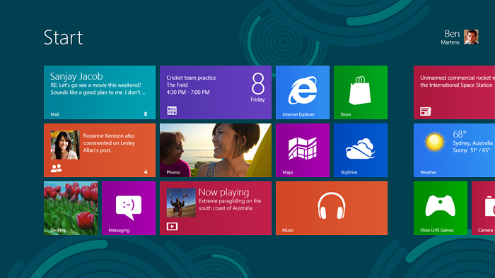
The Start screen was a radical simplification of the combination of the Start menu, system tray, gadgets, and taskbar. Rather than a finnicky and difficult to navigate menu haphazardly organized into some folders and some icons, you’d see a clear place to click (or press as we’ll see) and launch or switch to an application. It didn’t matter whether the application was previously running or not.
Combining launching and switching was long overdue. In the early days of a PC, knowing which programs were running or not mattered. It was an under-the-hood detail that surfaced to end-users who did not really understand why but had to concern themselves with running out of memory or slowing their computer down due to running programs.
With Windows 7 the taskbar was enhanced to provide a way to launch programs the first time and to switch to them after running. Users did so by pinning the application icon to the taskbar. We saw in the telemetry of the product over time that most users were pinning most of the applications they used and the frequency of launching programs from the traditional Start menu location dropped. Beyond that the Start menu became a repository for installed applications spamming user as most applications installed a folder of accessories, top-level applications, prodded the user to pin the application to the taskbar while leaving a new shortcut to the application on the desktop.
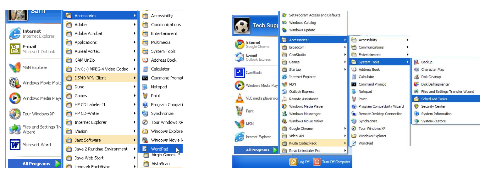
Typically, tech enthusiasts would pride themselves on vast collections of software installed on their PC. Often, they spent considerable time arranging, categorizing, and organizing their Start menus. This extreme in use cases is not uncommon in software and poses a design challenge. How does one design for a broad base case and an extreme case that often comes with substantial complexity for the base case.
In practice, however, the design of the Start menu itself began to fail at both the extremes of smaller and more portable devices as well as the increased use of larger monitors with high resolution running greater than the 1080P of high-definition TV. The Start menu had a sweet spot of screen size and resolution that was common on desktops almost a decade earlier. As typical PCs loaded ever more software while not dramatically increasing screen size, even the out of box experience of the Start menu turned into a dexterity test of up, down, left, right navigation. New large screen monitors demonstrated the challenges of a menu design even further as the pixel-distances to move to the small targets of the Start menu increased.
The trend was clear which was that screens would soon improve beyond what a good deal of Windows software was capable of handling gracefully and that would not substantially improve.
The Start screen “took over” the screen to provide a surface to do more (with less) while also acknowledging that a very small menu with a difficult navigation paradigm had hit a proverbial wall. The launch screens of phones and tablets were showing another way that rapidly became the most used experience for more people.
Still, when I first saw the iPhone launch and the apps organized as an endless grid, my first reaction, speaking to JulieLar at the event, was to ponder how long it would take Apple to add folders. By iOS 4 in 2010, folders were added. That followed a period where people would endlessly futz to organize apps by personal folders, by App Store categories, or sometimes just by color. Then in iOS 15 in 2020 Apple added the App Library which was a way of list all installed apps alphabetically while providing for search and launch.
Windows 8 would skip these intermediate steps. The design of the Start screen included folders, arranging apps in any preferred order, and an All Applications view. There was also a search command for apps. Additionally, when the Start screen was visible simply typing would invoke the search command. When Mark Zuckerberg, of Facebook, visited and I showed him Windows 8, this particular feature resonated with him. This was just before their pivot to mobile but at the time he pushed on launching the browser from there by just typing a URL. We considered that but were a bit reluctant to add more entry points to launch the “default” browser.
Taking all these features together, we exceeded the capabilities of the combination of the Start menu and taskbar and did so by reducing the number of concepts required to understand.
Located deep in the Windows 7 taskbar was a notification area, the third capability integrated into the Windows 8 Start screen. This area had become somewhat of a dumping ground for a wide-array of always available tools from the volume control to connecting to Bluetooth devices to a sort of mini-application that served to notify users of some important information such as stock quotes, weather, or other information sources. Windows Vista had also introduced gadgets which were an enhanced form of mini applications to show information such as news headlines and the like.
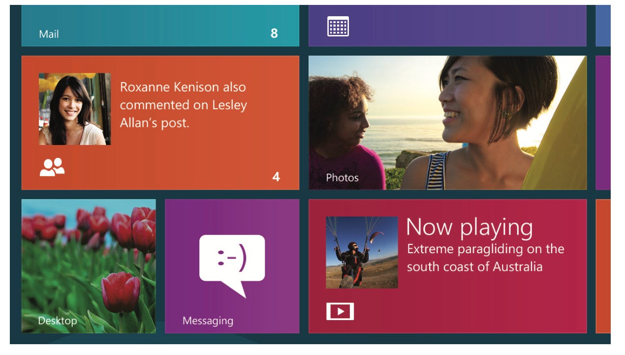
We chose to significantly expand this capability with Live tiles. The easy to press launching and switching buttons could come to life with useful information available at a glance. We went a step further and made it easy for developers to add additional tiles for users of an application to pin additional information to the Start screen, called secondary tiles. This was a feature initially on Windows Phone 7 and enabled pinning a single contact or stock quote to the home screen. This capability made further customization of the Start screen possible, again something not possible with the combination of Start menu, taskbar, and notification area in any system-wide manner.
The Start screen was naturally navigated with a mouse scroll wheel or a trackpad or using keyboard arrow and page keys. The Start screen itself was always available just as the Start menu was available, which was to press the Windows key on the keyboard. Pressing it a second time returned to whatever window was visible before. In this sense the Start Screen behaved exactly as the Start menu did, except it filled the whole screen. It was sort of like using a Netbook, though absent the dexterity required for a 10” screen.
On hardware with a touch screen, the touch experience comes to life. Perhaps no other element garnered more attention as it was defining characteristic of the new tablet era and the implementation detail that Apple used to define the iPad as a distinct device from Mac. Our view was an expansion and decidedly a course correction from Windows 7. Touch was now central to the experience as we baked it in across the whole PC experience, rather than bolting it on. However, the touch experience was designed to succeed when it was required, be there when desired but not in the way otherwise, or not present at all if the hardware did not support it. Executing this design truly tested the win as one principle as everything from boot through setup through daily use needed to consider the presence of a touch-only computer. Even the Tablet PC assumed a keyboard would need to be plugged in at times.
The team created what they called a “touch language” to describe how the design would feel to users. The touch language included:
Simple and consistent
Fast and fluid
Limited gesture set
Direct manipulation
Sliding gestures
Reversible gestures
Limit the use of timed gestures
My intent here is to continue to focus on the product strategy and not detail every aspect of the product design, but it is important to show how the strategy was reflected in some of these attributes.
Everyone wants their PC to be fast. As described in the principle fast and fluid, we aimed for a new level of performance. The change in hardware to high pixel count screens and higher screen refresh rates meant that a much smoother interface was possible. The introduction of touch created the imperative that the interface be much faster as well. The intimacy, and that is the right word, that one feels with a device using a touch interface is much deeper. The way your finger connects with user interface elements is not just about speed but about how objects move with your finger. The ecosystem liked to refer to this as a “sticks to your finger” level of quality. How swipe or tap or drag feels matters immensely. Engineering this experience involved all layers of the system and a deep understanding of how the elements of an applications—the buttons, lists, and icons on the screen—interact with content.
When the mouse was pioneered and implemented in the first Xerox PARC computer it had three buttons. Initially the concept of chording (as in a piano) was a key part of the design. Paul Allen thought that was too complex and limited the PC mouse to two buttons. Steve Jobs thought even that was too complex and Macintosh had only a single button. That did not last too long as many were soon connecting mice designed for Windows or using a keyboard modifier to get to the commands exposed when clicking the right mouse button—Office began supporting right clicking in Office 4.x which was widely used on both Macintosh and Windows. When Apple introduced touch, Steve Jobs proudly defined the interface as having only a single finger. That did not really last either as soon gestures were developed for a host of advanced, but often necessary operations. These gestures were mirrored to a degree on the Mac trackpad.
We knew from usage studies and telemetry in Windows, that the right click commands were frequently used. Beyond that, however, complex modifiers often went unknown by most users. We saw this with pen-based computing as well, where overloading the pen with complex gestures akin to those used by old-style proofreaders or combinations of clickable buttons on the pen were nearly impossible to discover.
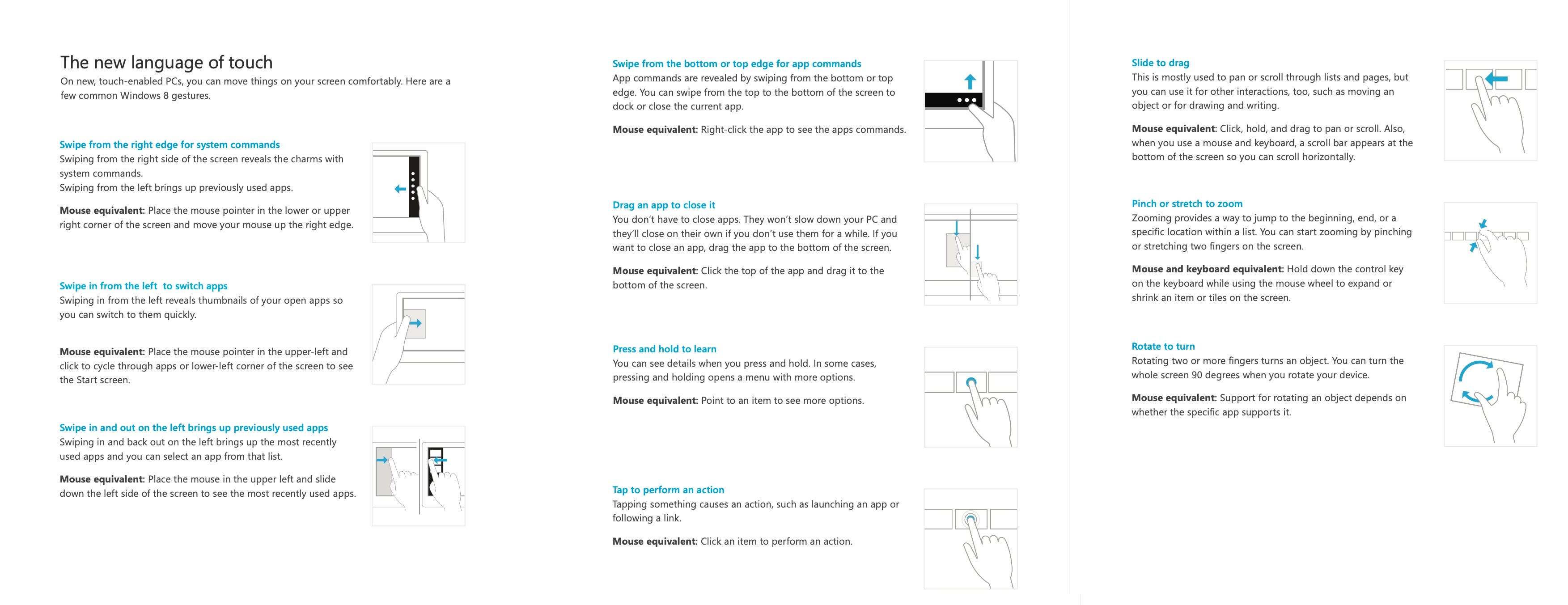
The Windows 8 touch language designed a finite and limited set of gestures that encompassed all we believed would be required to be highly productive in a touch environment. The design intentionally avoided complex chording gestures that are difficult to remember and awkward to implement.
The entire touch language consisted of ten unique gestures, from simply tapping to perform an action to using a thumb and finger to zoom or rotate (that’s two gestures) to swiping from the left (to switch applications) the right (for system commands) or the top and bottom (that’s four of the gestures in total, for app-specific commands.) For an application developer, they only needed to worry about seven of the gestures, as three were only used within the operating system.
The initial reaction to these gestures as being difficult to “memorize” was quite common among tech enthusiasts and tech press. What we saw in putting people in front of the user interface for the first time was a natural ability to experiment and to quickly master these basic gestures. People would simply tap and swipe around and as if by accident trip into the gestures or simply try something that seemed natural such as dragging, and it would work. Whenever we would say to the aforementioned techies that people discovered something by “accident,” they would counter that this was flawed logic, compared to being taught. Yet we had seen this same type of learning happen with right clicking the mouse. As if by accident, people discovered that the action led to a menu of the most important or relevant commands.
Today, every mobile platform exposes functionality by swiping from edges or even corners.
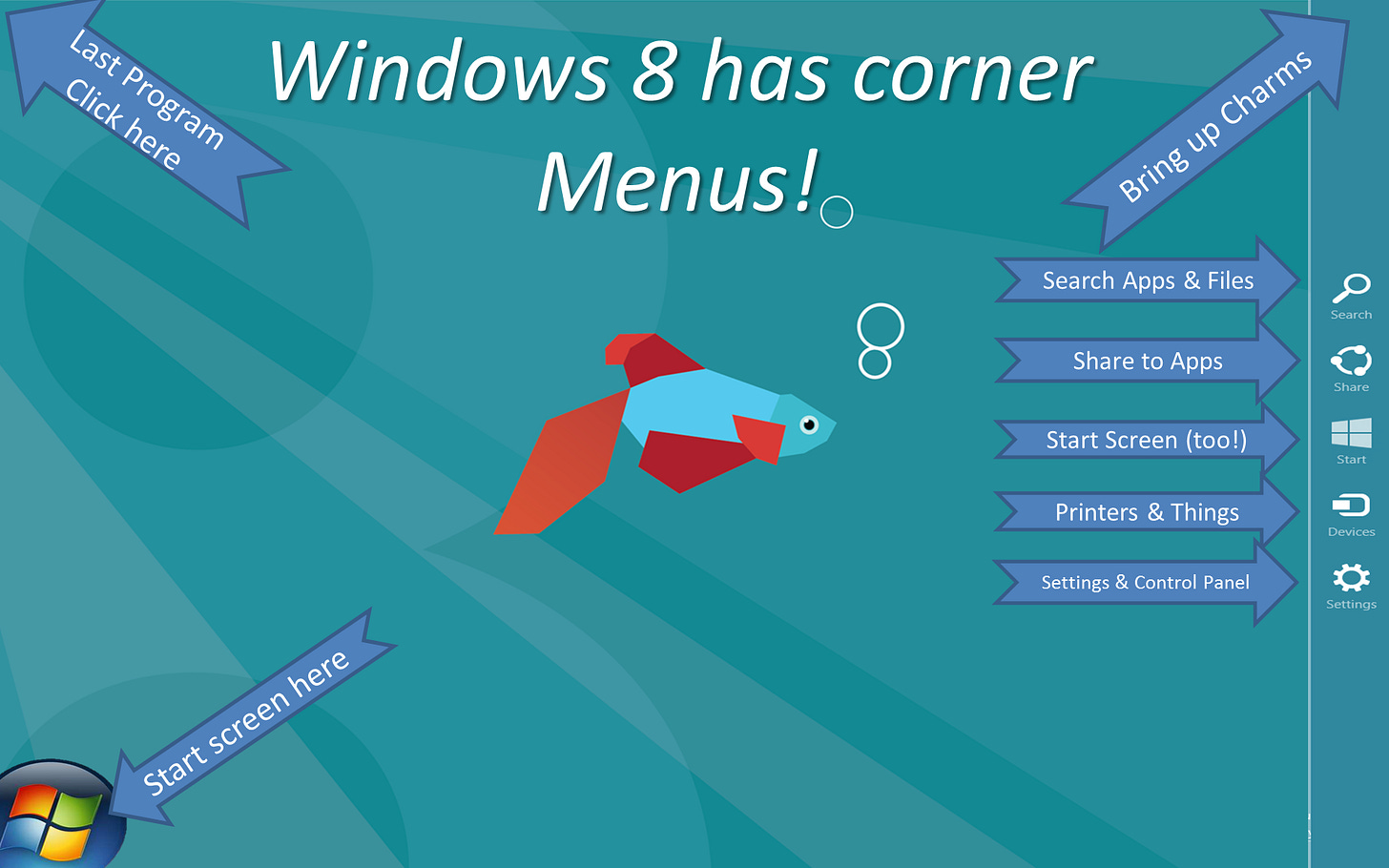
As we intended Windows 8 to be used for devices that were touch-only as well as no touchscreen at all, the gestures also had mouse and keyboard analogs. One of the more novel aspects of the mouse-centric execution was that we made use of the corners of the screen as touch equivalents for operations. The use of the corners was seen by some as obscure. In fact, at one point in the evolution of the product, we made a desktop background as a reminder of the corners, but mostly in gest. Why jest? There were two reasons. First, the corners were almost always found within a few minutes of mousing around experimenting. Second, to those in the design world the corners have special meaning as they are the easiest targets to reliably hit with a precision mouse—far more reliable that a single square button or even a menu command—by simply racing the mouse or moving on a trackpad without concern for stopping. The use of corners as hit targets is known as Fitts’s law, where the principles of the model essentially say the corners serve as infinitely large buttons. In 2021 JensenH made a video detailing the model which is linked to in the endnotes though we also spoke of it extensively in the e7 and b8 blog.3

The touch experience also provided for a robust on-screen typing experience. This typing experience included predictive autocorrect and support for a range of now standard on-screen typing features such as emoji and diacritics. Owing to both the PC heritage and a realization that touch gestures for very common commands such as Copy, Paste, and Select All would be tricky the touch keyboard included a Windows Ctrl to use those commands, arrow keys to quickly move left and right while touch-typing, and an option to display a full PC keyboard. Microsoft’s handwriting history also meant the on-screen keyboard could be used to recognize handwriting and insert text as though it was typed. No pen required! The first Windows 8 tablets came with wide screens and to facilitate typing a split keyboard was provided which could be operated with two thumbs.
The combination of the touch language and the new Start screen were a significant simplification and consolidation of concepts without a loss of flexibility or power-user features. There are a couple of common examples that almost no typical Windows user knew were possible with the Windows 7 world that were addressed by the design. Few knew, for example, that the Start menu could be rearranged by bringing up the menu and then dragging and dropping the icons and folders, or that an icon could be placed in a folder while dragging. Most just lived with programs in the wrong order on a crowded and hierarchical menu. These power-user features were valued but so mysterious as to be known by a tiny sliver of the user base.
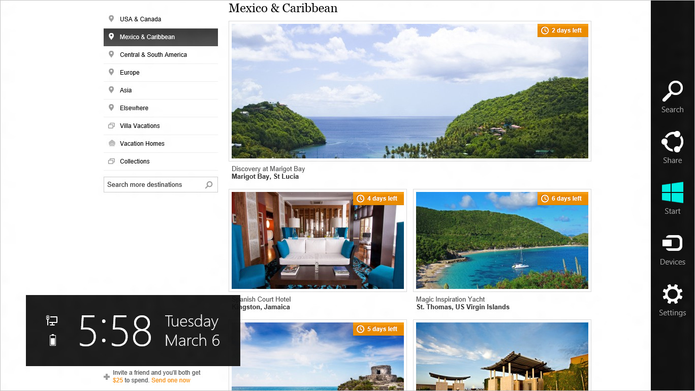
There are many system-wide commands that have historically been obscured or awkwardly placed in Windows, or worse implemented repeatedly but differently across applications. The last element of the Metro-style interface was the Windows 8 charms which provided access to system commands. The name charms came about because the icons displayed for the system commands of Search, Share, Start, Devices, and Settings were reminiscent of the clovers, hearts, stars, and moons4 of Lucky Charms cereal.
The center of Windows 8 were apps. With Windows 8 we aimed to do more than present a sea of apps, but to connect apps together easily. Most apps connected to each other by somewhat blunt constructs of the clipboard and files. Cross-application scenarios were often hard-coded by app developers who had little information about what other apps were on your PC. The charms in Windows 8 provided a connection for all apps to (appropriately) connect to both the system and other apps. The mechanism developers used to implement these connections will be discussed in the next section.
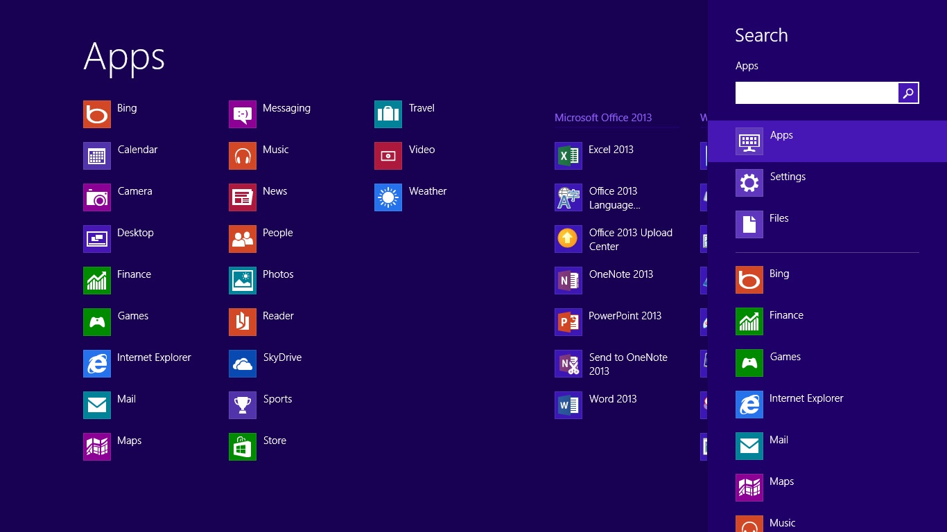
From a user perspective, the Search charm offered simple method to search not only your PC but the information available via your apps. In Windows 7 we provided file search that worked across basic file types. In Windows 8 we extended this to include using search to find apps installed on your PC and to allow those apps to search the information and content available to them.
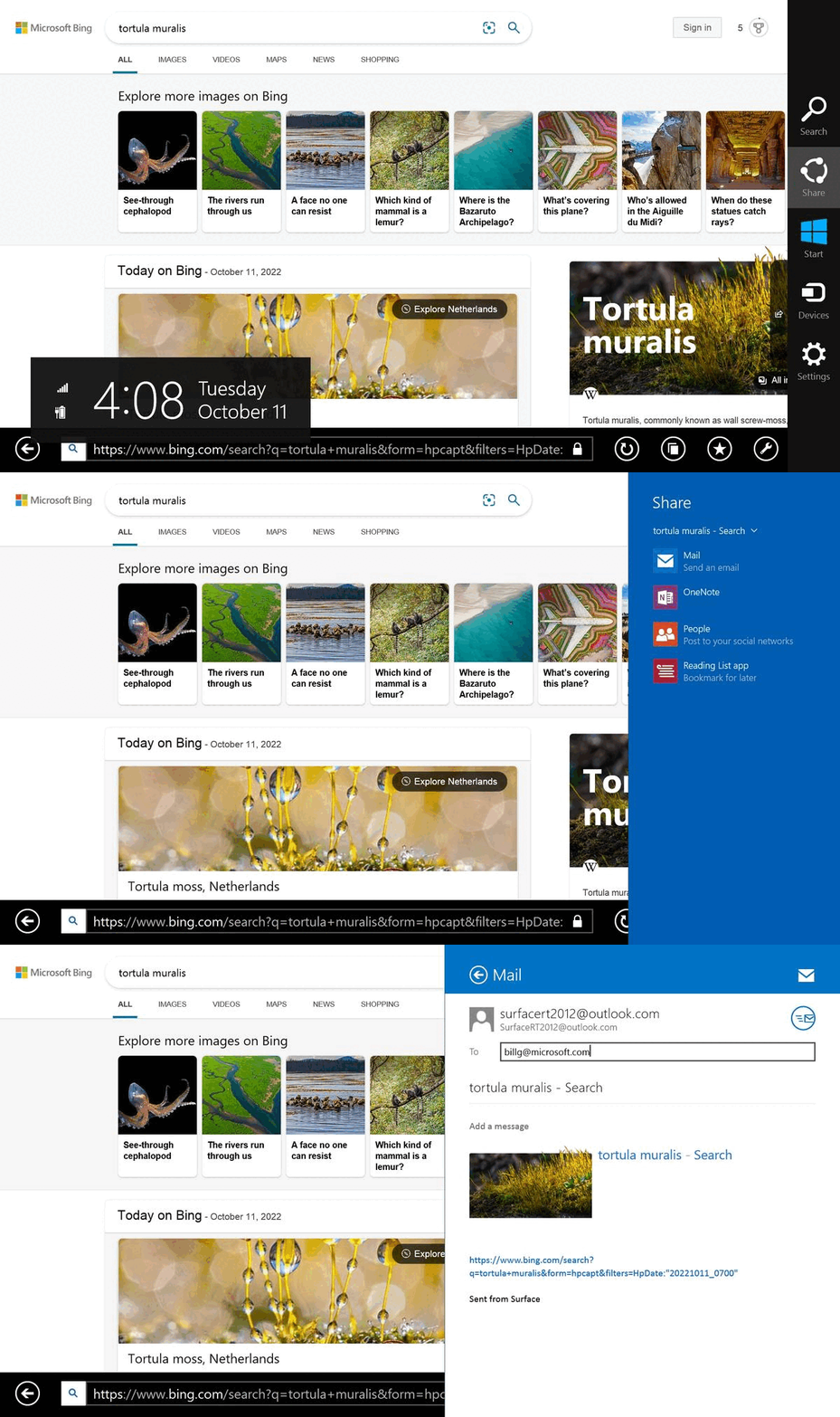
The Share charm provided the ability to share content such as photos, documents, contacts, or any other data with other apps. If you were looking at a photo, a web site, or a document choosing Share would connect whatever app you were using to the selected app. For example, sharing a photo to a social network app would guide you through posting that app on the network. Apple added this capability to iOS 8 in 2014.
The Start charm was an always available mechanism to return to the Start screen. It works just like the Windows key if you have a keyboard.
The Devices charm provided the connection of your PC to other hardware and connected devices. The most common devices to connect to included printers, speakers for playing music, and secondary screens either attached by cable or the new at the time wireless screens.
Finally, the Settings charm was the new Metro-style control panel. We knew this was going to be controversial for two reasons.
First, the Windows control panel had evolved, or perhaps devolved, to be a catch-all for an array of mini-programs to manipulate all sorts of system settings. These programs could be complex such as full anti-virus suites or even the control panel for managing your mail accounts in Outlook, which clearly did not belong there. Many people had grown up navigating this complexity and were able to somewhat fumble around the arbitrary categories to find settings they sometimes needed to change. The Windows 7 control had a search feature, but it was difficult to deliver on the promise because so much of the control panel was provided by third parties and the vocabulary of the control panel amounts to a set of inscrutable technical terms unknown to most.

Second, and painfully, from the start of the project we knew there was no way we would completely replace the current control panel in a single release. We were certain modernizing the control panel would take several product iterations. We built the Metro-style control panel to encompass the most common settings that also had the property of not requiring any device or OEM specific code. To get to additional settings the existing control panel remained and could be further updated.
The final, and as many would soon be debating, the most important part of the Windows 8 experience was the Desktop, the traditional place for launching and switching apps, working with files, and the place many people stored files they worked with daily “on the desktop.” The Desktop was the very icon of the modern graphical PC.
The design of the desktop in Windows 8 was straight forward—the Windows 8 desktop was the Windows 7 desktop, only much better. We improved the taskbar, file explorer, window management, the Task Manager, file copying, multi-monitor support, virtualization, and more. We even did what we could to embrace touch even more than we did for Windows 7. The improvements in the desktop experience in Windows 8 was probably greater in terms of developer hours than in Windows 7.
The reason for this was straight forward. The desktop was where customers run the millions of existing, powerful, familiar Windows programs that were designed for mouse and keyboard. Office. Visual Studio. Adobe Photoshop. AutoCAD, and many more. This widely used software continued to be feature-rich, powering the bulk of the work people were doing on their PCs, at the time. Browsing and mobile apps all but took over home and consumer computing scenarios with a precipitous drop in the use of Windows apps for desktop publishing, photos, home finance, and entertainment. Many debated if the browser on the iPad was complete or powerful enough for these scenarios. Bringing the desktop forward (along with the metaphors such as manual discrete window sizing and overlapping placement) was a huge benefit when compared to tablets without these features or programs. It was an explicit design goal of Windows 8 to bring this software forward, run it better than in any previous version of Windows, and provide the best environment possible for these products as they evolved into the future as well.
As the iPad grew in popularity the interest in traditional desktop apps grew with it. Many customers, particularly in business, wanted the power of apps like Excel or PowerPoint to accompany them on their lightweight, long-battery life, and travel-friendly iPads. There was a sudden rise in remoting solutions that might enable access to these tools. Unfortunately, for desktop apps touch was a poor substitute a for a mouse and keyboard, as we knew from Windows 7. Apple believed it would be a matter of time until these apps were ported or reworked for the iPad. We believed there was a role for a better operating system to support this scenario.
To some the desktop was a thriving ecosystem rich with software capabilities. We certainly wanted to believe that was the case. In that spirit we did not think of the desktop and the million (or millions) of Win32 apps as legacy. It was our greatest asset. That’s exactly why in the last section the first question Intel CEO Paul Otellini asked us when talking about ARM was if we ran x86 software.
Specifically, we didn’t view the desktop as “legacy mode” or “old mode” but simply as the interface tuned to running Win32 software with a mouse and keyboard. It was pretty simple.
The core questions we needed to answer during these early days was “What if someone only ran desktop/Win32 apps on a PC without touch?” and “What if someone mixed and matched Metro-style apps with desktop apps?”
We iterated almost endlessly on minute aspects of the design when it came to the main detail of going from the Start screen to the desktop itself. We blogged about the design choices and discussed them in many forums as the software was shown more and got in the hands of the first users.
The design settled on several core user interface elements. First, both desktop apps and Metro-style apps were first class apps. The way we thought of this was that ALT-TAB, the primary way desktop users switched between apps, showed every running app. We treated the desktop itself as a launchable app, from a large tile on the Start screen. This followed from the way that MS-DOS was launched from Windows when Windows was introduced.
Switching to the desktop was also available from more touch-friendly app switcher that was available via swiping from the left edge of the screen or mousing in the upper left corner. The desktop itself could be accessed by moving the mouse to the lower left corner, exactly where the Start menu was located. A user that instinctively scrolled or tracked to the lower left and clicked would be brought to the desktop.

Perhaps the most visible example of the desktop and Metro-style living together as equals was the way Metro-style apps could be snapped next to the desktop, mixing, and matching as one needed. The existing desktop-based Windows snap feature introduced in Windows 7 received some enhancements and continued as expected weather running only the desktop or with a Metro-style app snapped as well.
With these designs in place, it was time to show people outside Microsoft what we had been doing. We knew there was a lot to absorb and a significant amount of complexity to communicate. We decided to roll out the product in stages. Each stage aimed at a particular audience and sharing a particular part of the product. Recognizing the magnitude of the user experience change, we chose to begin the roll out at the most influential of industry events and almost simultaneously at the most important partner event.
I was a very weird combination of terrified, excited, and confident. I was terrified by just how much we had to communicate and how complex the message was. I was excited because the work was making so much progress and was so innovative. I was indeed confident because I’d seen how far we’d come and, frankly, I knew we had made the right bets given the state of the platform and what needed to happen to keep Windows relevant to a new generation of customers and strategic for the ecosystem.
We chose to unveil the first US demonstrations of Windows 8 at the All Things Digital D9 conference in June 2011. Just prior to the conference we seeded excitement for the conference itself with a preview. Jensen and team recorded a rather “DiY” video from the UEX program management design room. This video introduced the Windows 8 user interface. We dropped this video and quickly millions of people watched it. That might not sound like a lot today, but in 2011 millions of video views for a demonstration of a new OS was a lot.
We also showed a preview of Windows 8 in Taiwan at Computex just before D9. We took advantage of the time change so both demos were essentially in the same news cycle. This show is where all the Asian manufacturing partners and worldwide OEMs gathered to see the latest that would make for new PCs in the coming months and year. MikeAng and the Ecosystem team were responsible to this community and put on the demonstration. As with the above video, the word and images of this demo raced around the world.
D9 was going to be incredibly special, but we were, frankly, terrified. JulieLar along with JensenH and a half dozen others were scrambling the night before to get all the pieces to work—it wasn’t just the software, but we were going to show a bunch of hardware that also barely worked months before the official release.
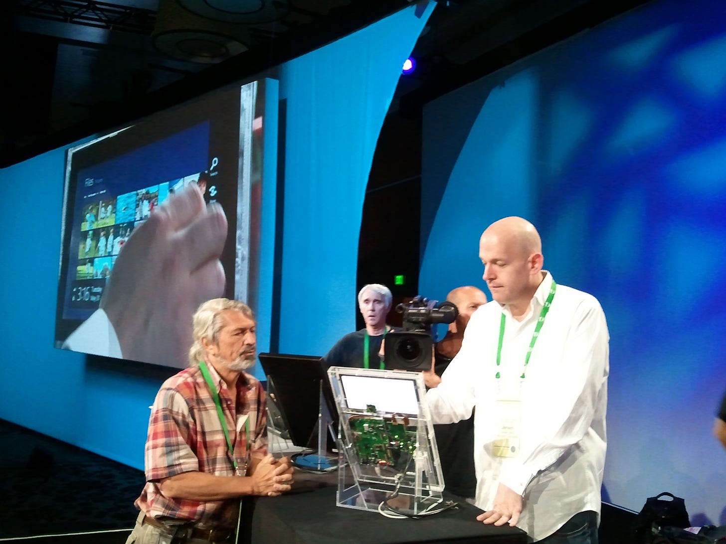
I joined Walt Mossberg on stage for an interview as JulieLar prepared to demonstrate her team’s designs for the first time. On stage, Walt peppered me with a lot of difficult questions about the state of Windows and even Microsoft. It was a particularly brutal year for Microsoft as the industry had coalesced around a notion of “Gang of Four” companies leading the future of technology, a phrase coined by Google’s CEO Eric Schmidt, no fan of Microsoft. His view of technology leaders of the time included: Google, Apple, Amazon, and Facebook. Walt wanted to know what it felt like to be left out.5
“Well,” I said, “nothing called ‘Gang of Four’ ends well.” Only a few years later, that inappropriate moniker would be replaced by the annoying FAANG, again without Microsoft.
Walt pressed more on Microsoft missing mobile and Windows tablets not taking off and focused on them not really having a touch-centric operating system. What could I say? He was right. Where Walt really pressed was on the quality of PCs. I suggested that Windows could be a great tablet (especially on ARM) because it brought the great parts of Windows.
Later that evening, some said to me that Walt was particularly hard on Microsoft and me in the interview. I didn’t see it that way. Everything he said was both true and exactly why we designed Windows 8 as we had. It was interesting to be on the empathy or sympathy end for once though. I wasn’t sure how I felt about that.
Almost on cue, Walt asked how we would show off a tablet. It is important to note the context and the importance of tablets to the audience and industry. They were a huge new development, and everyone was super excited by them. Recall, Walt’s review of the iPad and how he favored using it over his Mac or ThinkPad. That was Julie’s cue and I receded.
Julie came on stage with a battery of screens and computers, all working and ready, with a team backstage, collectively fingers crossed. I hovered behind her out of nervous energy, while Walt and Kara Swisher poked at screens and asked questions while Julie tried to stay on her script.6
The team had created a Lucite stand for a bare 10.6-inch touch screen display and the insides of a laptop, making for essentially a see-through demo tablet, like one of those old Ma Bell telephones made of clear plastic. The screen represented an ideal design size for a tablet, wide enough for a full-size keyboard, enough pixels for an HD movie, and able to show two apps at once. It was also the typical resolution of over two-thirds of laptops being sold.
Running through a fast and fluid demo, Julie showed off every key aspect of Windows 8 and Metro-style: design and typography, Start screen, gestures, immersive apps, snap, touch browsing with Internet Explorer 10, the on-screen keyboard including a split view (Walt had not seen before), and of course the complete support of the desktop apps everyone uses.
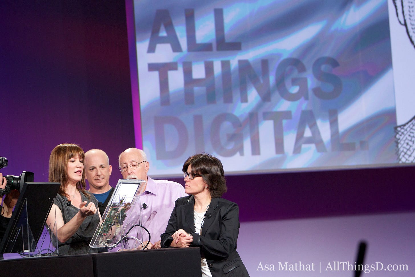
Walt called this the “biggest shift in Windows.” That was true. Julie finished the demo by showing the other PCs on stage, all Windows 7 PCs made better by Windows 8: a regular laptop, a slate, and a full convertible Tablet PC. Phew!
But once Kara and Walt asked the audience for questions, attention turned to the notion of “two modes”—desktop and Metro-style tablets—and a nagging concern planted itself in my head. How would this play out? What could we do better? They weren’t really modes any more than MS-DOS programs were modes. Or were they? We didn’t come up with a good way to explain it. And if we had to explain it, we were already in trouble.
To distill the feedback at the show and what we subsequently discussed in the b8 blog, the issue was that to some observers the desktop had been somehow relegated and obscured by the new Start screen, leading to three reactions. First, this created an impression that launching to programs (or files on the desktop) was an extra step away after starting a PC. Second, that going to the desktop was entering some secondary mode of Windows. Third, there was a visceral reaction that the Start screen was simply too big and got in the way.
The Start screen itself was (literally) a big Start menu and the desktop was (literally) still another program that was always running. In Windows 7 we even made the desktop show up when using ALT-TAB to switch between programs, a fan favorite, so the desktop already looked like another program. But making that clear was the challenge.
We continued to iterate and polish the design. Should we have a Start button or not? Should we have an option to boot the PC directly to the desktop? There were dozens of small changes made to the design and a series of several blog posts of thousands of words from the team discussing feedback, questions, and design choices and alternatives.
As with every past release of Windows there was disproportionate attention on the basic user interface for launching programs and manipulating files—I say disproportionate because absent applications these are the features used to evaluate a new release and compare to the previous one. These features are also disproportionately used by tech enthusiasts, particularly file management and organization. Windows 8 was no different.
This focus tended to overshadow that Windows 8 was moving up the stack so to speak and redefining the basic operating system to include innovation in the other essential ingredient of offering an end-to-end experience, internet scale or cloud-based services.
Operating on a different timeline through all of Windows 7 and then Windows 8, the Windows Live team steadily improved email, calendaring, storage, identity, and a host of other capabilities under the Windows Live branding, mainly bringing the capabilities of scalable (and cost-effective) cloud storage for every Windows 8 PC and customer, along with account management, email, photos and video, editing, and more. On their own each of these services aimed to be competitive within their categories, even going up against Google’s Gmail after a long road to improve the scale of Hotmail, renamed to Outlook.com. Even cloud storage, launched as SkyDrive in 2010 and then rebranded to OneDrive in 2013 due to a trademark conflict, had essentially under the radar become an integral part of the Windows 8 experience for roaming files and settings across multiple PCs and mobile phones including Android. We also integrated the new Office web applications (Word, Excel, PowerPoint for browsers that were started way back when I was still in Office) with both storage and email.
At the 2007 launch of these services Paul Thurrott even went as far as to say, “Looking ahead, Microsoft is working on the next generation version of Windows Live, which it sees delivering as a set of software and services suites, one each for the browser, Windows PCs, and Windows Mobile-based devices. The browser suite will provide common branding and user experiences, and will work in both traditional, PC-based browsers as well as mobile phone browsers.”7
There was much to be done, more than we had time for, but all the pieces were part of the plan and executing well. These services were shipping separate from Windows on their own schedule, with frequent updates and at the same time planning on aligning with Windows 8 as the critical cloud and service elements of the product.
The innovations (and inventions) across the experience and the platform prepared Windows for a new generation. The modern Metro-style experience in Windows—fast and fluid, immersive, touch-first, and connected—brought a PC up to the standards of the smartphone, which had defined a new level of interaction. Metro-style apps were a missing piece. Without apps, we had nothing but a nice project. We needed developers.
The experience described in this section was designed with a broad range of new operating system capabilities that would be made available to developers so they could build Metro-style apps—we called this the WinRT platform.
A couple of months after the iPad was available to customers, it was clear it was a hit product. By the June 2010 earnings call, after only 80 days in market, inventory constrained, and, still not shipping all models, Apple sold three million units for an estimated $2 billion. At the time it was the fastest-selling mobile device of all time. If I wanted to brush it off, I could have argued that PCs were selling that many units every few days or perhaps the iPad was just Apple’s Netbook. But that would have been short-sighted. As we knew, the iPad and the iPhone (and to some degree Android) were drawing all the attention of developers. Developer attention meant there was durability to the platform. The iPad ran all iPhone apps, and rapidly apps were being tuned for the larger screen of the iPad.
It was our turn to woo developers. The stakes were high.
But first, why do we even need a new platform to woo developers? We already had Win32, and .NET in multiple flavors, plus Internet Explorer and the web platform. There was a schism between the Windows platform and the .NET platform that had emerged over the past decade and went unchecked. It fell to the Windows 8 team to bridge this widening gap, but we had a product to build and the world was changing fast.
On to 103. The End of Windows Software
Some might consider this word failing in inclusiveness. I kept the original as we wrote in 2010. Microsoft Word today suggests artisanship or perhaps quality. I think “pride in craft” works as well.
UX Week 2012, August 2012, “The Windows 8 Story” by Jensen Harris or //build 2011 Conference, Sept 2011, “8 Traits of Great Metro-style Apps” by Jensen Harris
Jensen Harris, “The Hidden Way Plane Crashes Improved Your Laptop”
…and now blue diamonds.
“Microsoft Windows President Steven Sinofsky Introduces New Look of Windows” by Ina Fried, All Things D, June 1, 2011
“Windows Live 2007: A Look at the Next Generation” by Paul Thurrott, SuperSite, June 27, 2007

