052. Alleviating Bloatware, First Attempt
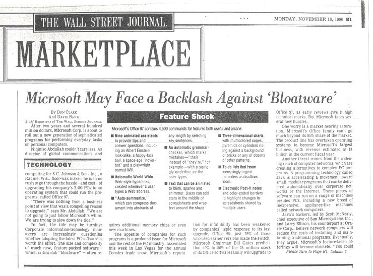
“Microsoft’s Office 97 contains 4,500 commands for features both useful and arcane.” —WSJ, 11/18/96
What happens when your biggest strength and greatest asset as a product development organization becomes your biggest weakness? Perhaps that is inevitable. With so many potential disruptive forces, at least that’s what we were hearing, it was almost too much that the very thing we really excelled at—building new features—would become a problem. While the idea of software bloat or even the phrase bloatware was hardly new, it was being applied increasingly to Office. This is the story of the first attempt at doing something about this issue.
Note to readers: Substack introduced a new feature this week—free excerpts with the remainder of the post for subscribers. I’m trying this out to see what subscribers and potential subscribers think. I do welcome feedback. The proceeds of this work do not benefit me, and subscribers can also join in the comments and discussions.
Back to 051. HTML: Opportunity, Disruption, or Wedge
Features. That’s all we ever talked about. Adding features. Fixing features. Missing features to be added or fixed. Office achieved the position it achieved, as precarious as it seemed now with the rise of the WWW and Internet, by adding more features with more regular releases of new versions than competitors. Reviews focused on features and we won reviews. We had built a team, an engine to add features.
As fast as Clippy could appear after hitting the F1 key, it seemed as though our greatest strength and our most significant asset—features—had become a great weakness. We went from dominating with more well-executed features to being crushed by the perception of the weight of our products. The industry latched on to the expression bloatware to describe products that seemed to have too much—too many features, too many megabytes, too slow, too difficult to use, or simply too much.
It was one thing to develop a strategy to address a customer problem we had created, albeit inadvertently, when it came to total cost of ownership. We even committed to building fewer productivity features, despite the internal backlash over personal productivity moving to priority six. It was entirely another thing, however, to look at what we built and be pressured into admitting customers didn’t want or need it. Still, customers were buying Office by the tens of millions of copies.
Were customers, press, and analysts right? Did we have a product problem, a technology issue, or a marketing challenge, or some combination? Of course, the development team was certain marketing wasn’t convincing people how amazing the product was. Marketing was certain the dev team was not delivering business value. Press and analysts were relentless. What could we do?
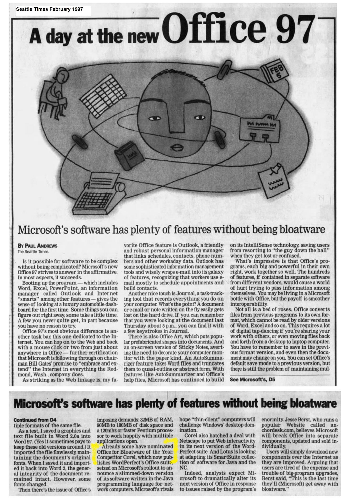
Our hometown Seattle Times reporter, Paul Andrews wrote “already some have nominated Office for Bloatware of the Year.” While unclear who “some” were and knowing there was no actual award (thankfully), that was a sharp dig in an otherwise positive Office 97 review.
Worse, however, was the headline in the Wall Street Journal that simply stated “Microsoft May Face Backlash Against ‘Bloatware’” right on the front of the Marketplace section. The article used every possible way to explain the scale of Office as big from “two years and several hundred million dollars [in R&D]” to “appetite of companies for such programs” it did not let up. The requisite quote at the start of the article from an IT professional was brutal “couldn’t care less… there was nothing from a business point of view that was a compelling reason to upgrade.” To this day I still get a sick feeling in my stomach from the box in the story stating, “Microsoft’s Office 97 contains 4,500 commands for features both useful and arcane.” Each of those features meant something we were so proud of and represented real effort. Plus, during the interview the reporter kept pushing for ways to talk about how big Office 97 was. I resisted and let this slip in a moment of pride, only for it to be used against me. I added this article to the binder I carried around and had it at the ready whenever the topic of bloatware came up.
Bloat was a constant source of strain in conversations with field sales, in the Executive Briefing Center, and with the press. Each time the topic came up I used my go to answer, which was that there is a set of features that everyone in Office uses and those are easily understood such as open, save, print, copy and paste, and a host of basic formatting commands. Everyone nods. Then I would talk about how each application has features that a few people use, perhaps footnotes, financial formulas, or animations in PowerPoint. Most would agree with that.
A common variant of this discussion was “your bloat is my crucial feature” or “yes this is bloat, except that one time a year I need to use it.” Most PowerPoint presentations are minimal when it comes to production values, except for that one time a year when the stakes are high and huge effort goes into making a great show. A favorite example is that few claimed to use Mail Merge in Word, until they find out they need to send out holiday cards or invitations to a large group (and yes, it even works with email!). Bloat rarely considered the frequency of use and often presumed infrequent use meant no use.
I would point out the significant business value of Office was that any person could use their set of features in any one tool and seamlessly share files and collaborate with someone way more advanced than they were. For example, I don’t know how to draft a contract and use “red lining”, but a lawyer could use those tools and send me the contract for review. Intellectually people understood, but almost always would shrug and still say that the software is “bloated”.
To each constituency, bloat implied something different. There were mundane answers like how much disk space or RAM Office took up. These Moore’s Law measures were easy to complain about but were especially incorrect relative to competitive products, Office was far and away the best. Unfortunately, no one ever experienced more than the one product they used so if Office seemed slow and all conventional wisdom was about needing to upgrade hardware with more memory or a laptop that ran out of disk space, then bloated Office was to blame.
Some believed that literally having too much stuff on the screen is what made the software slower or bloated. There was some truth to this in that the user interface of Office—the menus, toolbars, wizards, and more—was rapidly growing and exceeding the available pixels on the most common screen sizes, especially on new laptops. While desktop computers were getting larger monitors, laptops, still uncommon, were also a generation behind in the amount they could fit on the screen.
The industry analysts believed in something of a combination of all these factors. There was a view that the older legacy features of the product were weighing the programs down with old code, or cruft, and that if the product could just be “factored” [a technical programming word, to break the code up into smaller pieces] then we would have much sleeker and more tuned products that took less memory, less screen real estate. Analysts viewed the disruptive technologies of Java, HTML, and components discussed previously as somewhat magical answers to bloat. Frustratingly, many thought these new technologies not only made better products, but the results would be bloat-free as if by the magic of the programming language. In moments of frustration I would point out the obvious, that if a product didn’t do very much it would of course be less bloated. There’s a good lesson in potentially disruptive technologies in how all the positives flow to them and none of the negatives, with little proof along the way.
These stories and definitions of bloat were endless. I received letters, emails, and every Briefing Center visit offered more anecdotes. It was exhausting. Perhaps the worst part about every one of these encounters was that after complaining about bloat, the customer would invariably start talking about new features in the product they so desperately required. And as if to rub salt in the wound, a good portion of the time these requests were already somewhere in the product submerged in the user-interface.
We had a good deal of intuition about bloat but not a lot of hard data. While we had our instrumented studies and knew without a doubt that much of the surface area of the product was used in practice—in total, not by any single person—we were working with limited data sets. It would not be until the next release that we would greatly expand our use of the internet to understand real-world usage.1
When companies in the 1990s needed to understand customers, they did focus groups. Researchers fanned out around the world on a series of focus groups to better arrive at a shared meaning of bloatware. While we did not learn anything new, we did obtain some more anecdotes and lots of hours of video tape of people complaining about the product.
We had to do something.
One way we reduced the perception of bloat was to not install less frequently used bits of Office on the hard drive, and rather to install them on demand. This was a feature designed specifically for IT professionals who were touting the advantages of disruptive components. In every story about components, especially those built with Java, the idea of loading features as you need them “on demand” was an advantage. The Total Cost of Ownership efforts built an entire infrastructure to load less frequently used features in this manner, conserving disk space, not bothering anyone. IT professionals hated this in practice and immediately loaded everything on the PC to avoid any “on demand”. Exasperated, we learned the idea that someone (mostly an executive) might be on an airplane wanting a template or a help file that was not loaded on the PC and seeing the “Please Insert Your Office CDROM” error message was unacceptable. Why take the risk, they would ask, it was just some extra disk space!
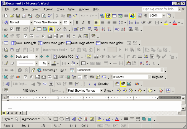
We really wanted to do something about the feeling of bloat. How could we make Office feel lighter weight, less overwhelming, and more approachable? Hanging on an interior office relite near DHach’s office the whole release was an old cartoon from a tech magazine titled Office 2000 proclaiming what a future word processor might look like. The drawing was of a Word document surrounded on every side by toolbars, buttons, widgets, and more—almost the entire product screen was consumed by interface widgets with a tiny little spot to type. This really was the bloat we needed to fix. But how? We knew the features were used and we couldn’t just delete them.
A common refrain from focus groups and our own intuition was that customers really wanted Office to be tailored to their own usage patterns. It seemed obvious that if Office just knew what customers wanted to do and only presented those options then it would be more valuable, rather than pushing a bunch of features that might confuse or slow down work.
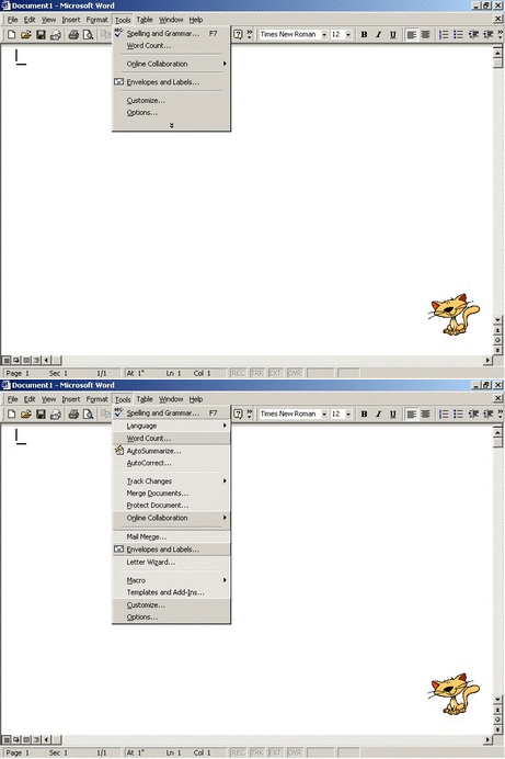
Rooted in our own history was a hint at a possible answer. A decade earlier, as the early Macintosh and first Windows versions of Word and Excel were being built, the teams implemented a feature known as Short Menus. This was an early answer to a common PC paradigm of sort of a beginner and expert mode. Even Macintosh had two modes for the desktop, a standard one and a simplified one called Simple Finder. Short Menus would show only the most common menu commands. One could easily choose a menu command (the irony was not lost) Full Menus to show off all the possible commands in the product. Switching back and forth could be done by just choosing the menu.
This was supposed to make the products more approachable. Instead, it just introduced another menu command that made little sense and added a step to using many commands, assuming one even knew to consider this modality in the first place. This idea came and went with the early PC era, along with the idea of expert modes. As the products evolved and added toolbars, the idea of simply hiding menu commands made little sense given the importance of toolbars. But toolbars also contributed to a bloat perception.
DHach who was leading the user interface program management team in OPU, along with a college hire from Cornell, Mike Arcuri (MArcuri), created a new interaction model based on an idea originating on the development team. We were certain they helped reduce bloat. We called this IntelliMenus (as in IntelliSense) or smart menus as a working name, and ultimately marketing referred to them generically as intelligent menus. The implementation was a smarter take on Full Menus/Short Menus, and also applied to toolbars. It built on our investment in the unified codebase for menus and toolbars that was working so well for us. It was clever, intelligent, and used our code architecture well.
The Office9 feature was subtle. First, it was always on. By default, the product curated short menus; based on the instrumented studies. We were confident of what was used frequently. Second, MArcuri created a series of heuristics to determine if a user might be intentionally browsing for a command or lost trying to find a command, and at that time the short menus or toolbars automatically expanded to full menus. A user could also click on what looked like an arrow key to manually expand to full menus. Intelligent menus were an IntelliSense answer to the age-old idea of having special modes that were hard to find and often confusing, and instead they learned from how the product was used and adapted over time. We built a personalized Office.
The feature proved attractive in early previews. In press briefings, we were lauded for taking on bloat and no longer ignoring the rampant problem. While most feedback was positive, as we expected, in beta feedback those who understood the product felt this was a bit of a who moved my cheese? scenario. Interestingly, the OAC representing LORG desktops had a unique take—there were some views suggesting that the shorter menus be permanently on so as not to confuse people, along the lines of the old short menus feature. Others were concerned about the training costs and, in particular, what a how-to call would be like if the person at the other end of the phone could not be certain of which menu items or toolbar buttons were visible. Hypothetical calls were always based on a VP calling at odd hours on some important trip with little time to spare. Again, as with the trendy on-demand, the reality is the enterprise IT world aimed for stability and completeness over anything dynamic or adaptive.
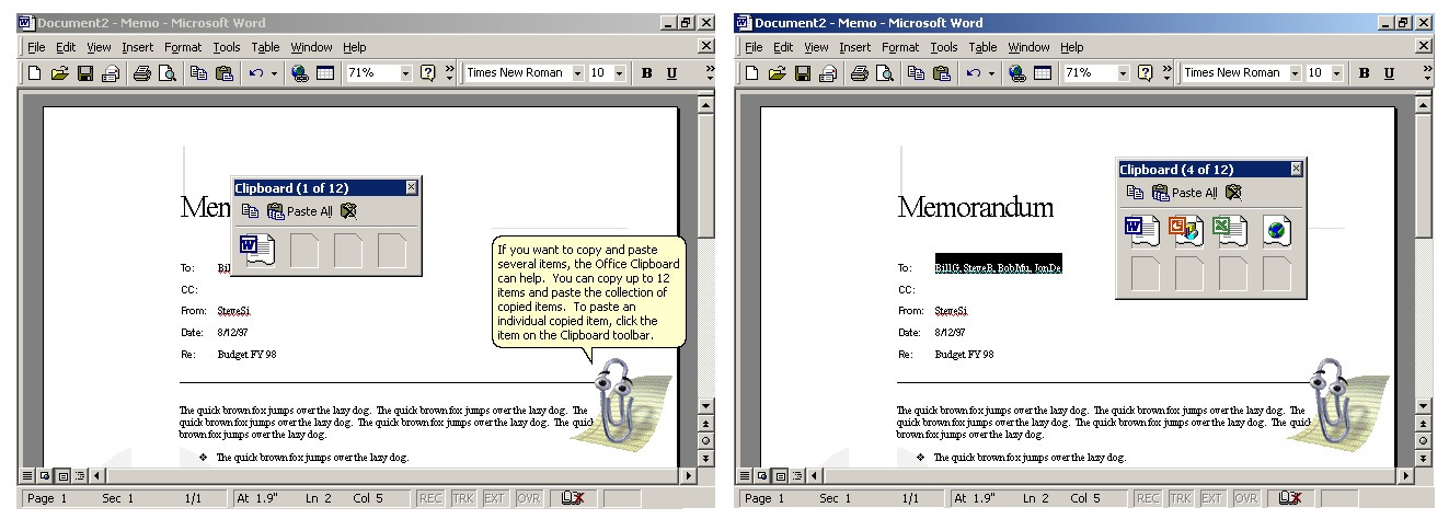
Smart menus were a solution to take on bloat of known features. They did not solve the challenge of discovering new features. We were keen to add new features as well as make the existing features easier to use. That included how Office could better support creating documents by gathering up information from the web to create a document. Researching a topic of interest changed dramatically with the WWW. Instead of writing memos or slides from paper notes or cards, research was increasingly based on browsing web pages and stealing bits and pieces from around the WWW. The workflow for this was incredibly difficult: see something on the browser, select and click copy, and then back to the document to click paste, over and over again. Taking a few different parts from the same document was a window-switching pain. DHach’s idea was to be able to just keep clicking copy, select more content, copy again, over and over without returning to Word to paste every single research find. Then when ready, the user went back to Word or PowerPoint and clicked paste, paste, paste over and over. This was also a great use of HTML because the formatting from the web could be maintained (at least with Internet Explorer).
The Office clipboard was a fantastic demo showing integration across Office and any browser and even other applications. The brilliance of the feature was that it created a whole new scenario without adding more menu commands (no bloat) or new features to learn, sort of. The feature activated if the user copied twice in a row quickly and no one did that by accident. We were, however, quite stuck on how to make this feature more discoverable so the user would know all those bits were sitting in a magical clipboard. We were constrained by perceptions of bloat, yet like so many new features, we needed a way to surface it to customers and decided to take the same route as AutoCorrect, which was a minimal user interface.
The Office Clipboard was a notable example of a feature already in one product (Word at least) and then added to all of Office but was routinely requested by customers. The feature was demanded so frequently that there were dozens of separate add-ins, products, and downloadable tools that offered a shared clipboard feature. As was often the case, when a feature was part of a large and complex product bundle it was often easier to find a separate, stand-alone tool that did what was needed instead of finding the feature in the big suite.
The struggle of discoverability and bloat continued to be enormously challenging for Office. It was fascinating how our skills at creating features exceeded our ability to make those features discoverable or create a product overall that remained easy to use for the broadest set of customers. This was an existential problem for our business as the WSJ pointed out— “One worry is a market nearing saturation”—if people have the product and feel it does everything they need, then our business is shrinking.
This kept us up at night, but not for the business reasons as much as the reality that we just knew people were constantly asking for Office to do more and to make it easier and faster to get work done. I used to say “Office 97 is hardly the ultimate achievement in creating, analyzing, and presenting information. We know we can do better.” We were primarily competing with our previous version—also bloated with all anyone might ever need—and that proved to be a tricky situation. This was especially difficult in the enterprise market where the benefit of any new feature was weighed against the cost and challenges of deployment and re-training. Given the investment customers made in that prior version, we were limited in how much we could market against it. It was not lost on me that the competitors we did have (Star Office, SmartSuite, Perfect Office, and Arae-A Hangul and Kingsoft WPS outside the US) were consistently adding features we already had and touting them as new. Each was making the mistake of competing head-on with the incumbent. It would be years before a product would take web-based productivity tools in a different direction.
Otherwise, there were no lean or unbloated alternative products people could point to that were in use. There’s much more going on to bloat that we would need to discover. What was the relationship of Office to Windows, and the rest of the PC? How were PC problems such as grinding hard drives, degraded performance over time, or just flakiness, bugs, and instability related to bloat? How much of the problem of bloat was being caused by enterprise IT software that people disliked (who likes their work software?) and worse the security and management tools that took ever-increasing control of the PC. The problem of bloat is bigger than just Office. It was the product’s ubiquity and, frankly, high customer satisfaction (no matter how we measured it) that made it a symbol of a much broader challenge for Microsoft.
In this work, I want to share the lessons with plenty of context and not a lot of certainty about how lessons might apply in a different context. The notion that products get easier to use and more approachable simply by hiding or deleting features is something I’ve seen disproven repeatedly. Rarely can simplicity come from simply hiding capabilities that people use, and in fact as we saw in this story, often in the process of obscuring features the product becomes more difficult to use. Lesson learned.
I wish I could say that slowed our feature machinery, but it did not. We were doing more than ever, faster than ever, but we were at least more aware of the challenges we were faced and every day becoming more empathetic. The dialog around adding features changed from how fast to how well, from must have to will it work. We were maturing as a team. This became more important as the demands for features to support broader, and much less clear, strategic initiatives increased as we built Office9.
On to 053. Strategy Tax: Outlook Storage, First Attempt
BradWe, leader of the design and research team, co-authored an academic paper with researcher Leah Kaufman (LeahK) Too much of a good thing?: identifying and resolving bloat in the user interface in ACM SIGCHI Bulletin, Volume 30Issue 4, Oct. 1998 pp 46–47. This was a workshop sponsored/hosted by the Microsoft team at the time, where other papers on the topic were presented as well.


We did loads of user research to get to the bottom of this bloat sentiment. We even hosted a workshop at the annual ACM Computer Human Interface conference in 1998. While it was easy to find people who complained about 'too many features', nobody was willing to part with any. And when they got tucked away in expando-menus they wished they were there again. It's like the Joni Mitchell lyric from Big Yellow Taxi..."You don't know what you've got 'til it's gone." Leah Kaufman did the bulk of the research. We wrote a summary paper here: (sorry, ACM paywall) https://dl.acm.org/doi/10.1145/310307.310370
I remember Heikki saying "Install on Demand" or "Just in Time" (JIT) Install was really "just to late"; which goes along with the OAC's desire to "just installing everything".