081. First Feedback and a Surprise
As the demos show, the most obvious departure from the past is that menus and toolbars are all but wiped out. —Jakob Nielsen (Nielsen-Norman Group)
We’d been working on Office12 for almost two years and the product had made enormous progress. The team was buzzing, and everyone was very excited. This product was different. We were building something we could all feel. It was a product that was good for individuals, not just organizations. Still, no one outside the company had seen it or knew of the monumental changes we were making. The user interface in Office was not just a user interface for the PC, for many many people for the past 15 years it had been the interface for the PC. We were quite confident. JulieLar was confident and prepared. This was a big moment, the first public showing and then the first feedback.
Back to 080. Progress from Vision to Beta
The first lesson of interface redesign: Do not unveil the design with static pictures.
The second lesson of interface redesign: Do not unveil the design with static pictures.
At the 2005 Professional Developers Conference (PDC), Chris Capossela (ChrisCap), Corporate VP of Information Worker Marketing, joined BillG on stage for a sweeping demonstration of Windows Longhorn along with the first public reveal of Office “12” (the quotes with a space became the official way of writing the name). ChrisCap and the marketing team zeroed in on the positioning of “Better results, faster,” while also pointing out that Office was “New, but feels familiar.” The demonstration zipped across Excel, Word, and PowerPoint, showing all the elements of the redesign and dozens of new features, along with many others previously undiscoverable. I was sitting anxiously in the very back of the room gauging how people reacted. I did not have to listen too carefully as during the demo someone shouted out to the stage, letting everyone know how they felt.
“Ship it!” they yelled.
We were still two months away from the first public beta, but this felt good. Only afterwards watching the tape did I realize we were being made fun of. Chris inadvertently missed a beat in the demo. His words describing what should happen did not match what was happening on screen. It looked like a bug and “ship it” was a classic Microsoft reference to shipping something with bugs. Nevertheless, the reception for the demo was quite positive.
The excitement spread through the industry.
Technorati, a tech news site that measured the important or high impact blogs on what was then called the blogosphere, was the place to be seen in the press. Our redesign made that home page, a first for plain old Office.
Despite the excitement of the moment, we learned a good lesson.
The video of the keynote was posted, but in 2005 not everyone was hip to consuming video. That meant that the still images (from Treo phones and the like), screenshots from the event, and JensenH’s later session made their way around the blogosphere. That proved to be a mistake. The spread of simple static screenshots for such a major change in user interface was not the way to communicate the redesign.

Almost immediately we were confronted with a wave of comments proclaiming the Ribbon to be too big and that it took up too much of the screen—assertions made by comparing screenshots to the current version of Office and making snap judgments. Attendees at the developer conference were counting pixels but not considering the full scope of the design or the experience. Besides, there really was the same amount of room for content—that was a key point of the design.
We did not anticipate this level of dissection, and that was a mistake. This immediately reminded us, especially JensenH, of his redesign of Outlook and the furor over the layout. Recall from the previous chapter that we had a spirited debate among early testers over whether the layout displayed fewer or more email messages. The question being asked was whether the ribbon took up more space than the toolbars and menus previously there.
We had some work to do.
Lost in all the comments about how big the Ribbon seemed to appear was the fact that we eliminated the row of menus entirely. Some comments and blogs slowly absorbed that reality over the course of the day as the magnitude of the design began to sink in. The Ribbon was not, as people thought by looking at a static screenshot, a big, fat, tabbed toolbar. It was so much more.
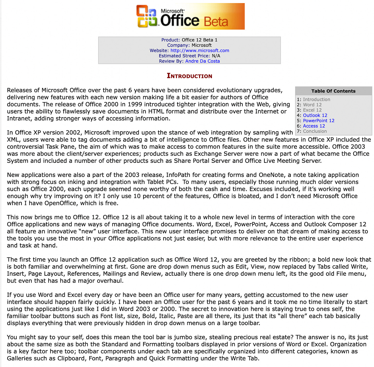
Also missing from this discussion were the differences between tech enthusiast or developer use of the product and typical users. We knew the typical user interface experience from instrumentation. Most users ended up with two rows of toolbars, the main menu, plus toolbars floating around the screen, and the side pane (that innovation from Office XP) each obscuring the document or squeezing in on the user’s work. By contrast, a very small number of tech enthusiasts prided themselves on purposely designing and maintaining a very select set of commands, often in a single floating tool palette (itself a very poor choice unless you have a giant screen, which many developers did). This was not the real world or even the base case, though we would eventually craft an answer for even this hyper-customized form of user interface.
In hindsight, letting the static shots out without video or animation was a rookie move that we corrected eventually. We were at the earliest days of real-time reactions to product launches.
Microsoft had recently begun using video as a means of connecting with the tech enthusiast community. The Developer Relations Group (DRG) created an online video site, Channel9, hosting videos with product leaders from across the company. JulieLar initiated the ground-level engagement as a companion to the PDC by recording a casual and friendly 40-minute discussion along with demos from her office. This video made a huge difference and began engaging the techie crowd with a good deal more information.
Simultaneously, JensenH began his new blog. Blogs were the rage among product leaders. Many of us maintained “external blogs”, or blogs that were visible to anyone, something that seemed risky for big companies at the time. Jensen shared his first Office12 posts after his PDC afternoon presentations. The blog was titled, Jensen Harris: An Office User Interface Blog. Portions of his blog can be found on a Microsoft site with a table of contents, but unfortunately Microsoft changed platforms and all the images have been lost. https://docs.microsoft.com/en-us/archive/blogs/jensenh/table-of-contents (individual posts can be found on archive.org).
JensenH had many talents beyond his obvious software skills and his regular performances with the Seattle Symphony. He was also a fantastic writer, a style he honed while writing a column in high school for USA Today. His posts detailing the Office12 redesign were not only incredibly well executed but ultimately served as a model for how a product could and should engage discussions on building software at scale. Through the course of the remainder of the release, and even today, these posts serve as reference materials for one of the most substantial redesigns Microsoft ever undertook (so far!). While obvious today, the press and reviewers were also following the posts carefully—something we took note of and proactively communicated with them. We never edited, cleared, or otherwise scripted posts. Jensen did this all on his own and under his own supervision, with the goal of detailing “why we’re changing the UI, not just how we’re changing it.”
Incidentally, this became another story of an Office process spreading virally across the company. I was often asked to point to the team in marketing that was doing our blogging and to the blogging strategy deck. It was one of those moments when I recognized parts of the company were scaling or growing up differently than Office. In other parts of the company, something like a blog would be a team, a budget, and a process with meetings and so on. We had none of that. It was just JensenH (and others) writing. We’d occasionally talk about topics to cover but otherwise it was an entirely organic effort. The key was that there was no strategy or oversight or overthinking, but just telling the actual story of the design and responding to the legitimate questions about it. Nevertheless, Gavin Shearer (GavinS) on the product planning team wrote up a blogging whitepaper so the rest of the company asking could see that we had some structure. Gavin met with several of the team’s bloggers to see how they worked and turned that into a guide for the future. It makes for an interesting historical record contrasting with today’s carefully crafted and managed communications. It served as a foundation for how we would later manage the larger task of writing about Windows (more on that soon).
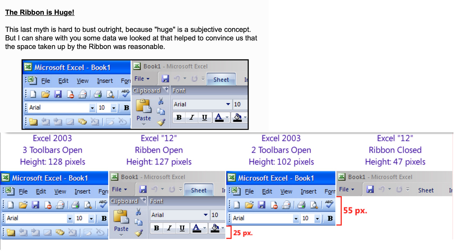
Among JensenH’s first posts about the Ribbon were pixel-by-pixel discussions of the size, even discussing alternatives that had been suggested in other articles and comments. In a post called “Mythbusters” (the TV show with the same name was popular at the time) he helped readers to see why the Ribbon was far more than a fat toolbar or why the layout was organized by usage frequency and scenario, not implementation category. For each of the main areas of innovation in the design, Jensen walked through in detail the design in a calm and factual tone, along with humor, and colorful (and embarrassing) comparisons from past releases of Office. The posts were wildly popular and served as a model for much of the future blogs our team would author.1
The two months from the PDC to the technical beta went by quickly—a good deal of product work was needed, but time flew by because of the incredible interest in what we were cooking up. Fairly low-key beta tests were the norm and only moderately interesting. Suddenly techies clamored for access to the release, which we limited because of our own views of quality and inability to support full-time usage of the product.
We got some early instrumentation on usage that started to confirm much of what we hypothesized with respect to the design (noting that these early users were intentionally trying out many parts of Office they might not routinely use). Those who got hold of the beta were clearly exercising a lot of the product and trying it out. It had been a long time since there was so much excitement about a pre-release version of Office.
In November, we released the technical beta, which was open to developers, enterprise customers, and the Microsoft MVP community, Most Valued Professionals, who played a key role in the beta process of the Office12 redesign. Most enterprise customers did not tend to pick up early technical releases for evaluation.
Who are these MVPs? We were briefly introduced to this group of supporters when they initiated something of a protest against the new Visual Basic .NET, referring to it as Visual Fred because of the lack of relationship and compatibility with their much loved Visual Basic. As we’ll see, compatibility and respect for the past are super important to MVPs who pride themselves on deep knowledge of Microsoft history and products.
The MVPs are an elite selection of consultants, educators, writers, and generally independent thinkers who are deeply committed to Microsoft products. Each of the major products has a group of MVPs from around the world assigned to it, with the MVP program managed by a central corporate team. Becoming an MVP involves a rigorous nomination and selection process along with reapplication when a term is up. MVPs take great pride in their role and commit significant effort, and often their livelihood, to Microsoft products. It is such a big deal that most readily identified their MVP status in email signatures, resumes, business cards, and today on LinkedIn profiles.
The MVPs are super important to the product once it is released. Many books, training videos, and courses on products are created by MVPs. Many command large audiences online and are the key creators of how-to content in many forms. While the program is centrally administered, including a yearly MVP conference, the product groups all have people assigned to serve as liaisons to their MVPs.
Over the years, the Office MVPs grew a little anxious in that they generally felt they did not receive enough insider information on planned features and ship date. My sessions with the MVPs sometimes had a bit of an edge because I did not use the forum as the first or earliest disclosure event. There was frequently some tension between the promises made by the managers of the MVP program and the product groups like Office in how they positioned the program relative to disclosure and influence on products. Office was perhaps unique in designing for a broad audience of many stakeholders. The most engaged MVPs were like the close-knit IT managers the Windows Server team managed with minimal risk to their IT-focused disclosure and business. I was always cautious of over-indexing on specific customers, especially when we knew they were a deviation or two from the typical user. One of the more challenging aspects of Office was how everyone tends to believe their use is widely representative of others, even software professionals who know this tendency but sometimes have trouble resisting the temptation to represent themselves.
I wanted to find a way to address this gap while also recognizing our responsibility to enterprise sales and customers. Regardless of the forum, I never wanted to be in the position of over-promising with a risk of under-delivering. I strongly believed sharing was committing and failing to deliver to customers had a high cost. Before the November beta, at the yearly gathering of MVPs in Redmond, we had a special session for the 50 or so Office and SharePoint MVPs.
They were invited but didn’t know it was special.
After JensenH did a never-before-seen talk on the Ribbon, I walked to the front of the large meeting room and sat on the speaker’s podium at the side of the stage.
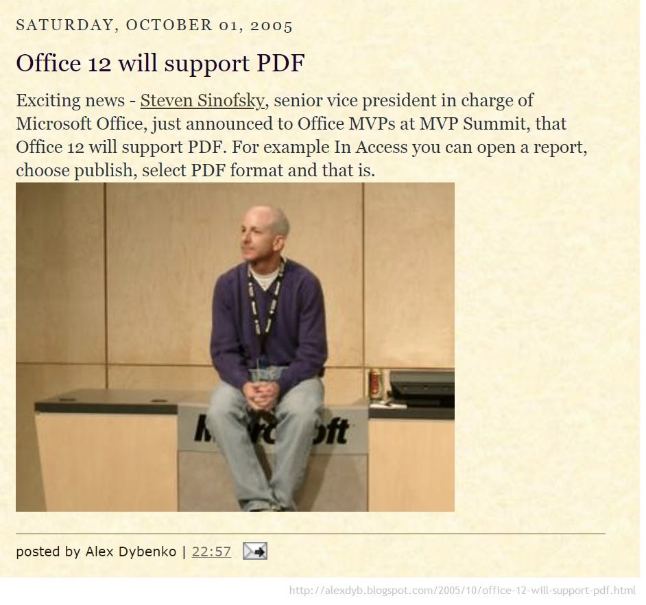
“There’s a feature in Office that everyone has wanted forever and been asking about for as long as I could remember,” I said. It was a feature all our competitors provided, and some even claimed it to be a huge advantage over Office. I continued, “available in the public beta in a few weeks, Office12 would provide full support for saving files in Adobe PDF format.” We simply called this Save As PDF, exactly what everyone would have called it no matter what we named it.
The room went crazy.
I hopped up onto the stage and showed a click-through demo of the feature working exactly as expected. PDF was another file format option in the File Save As flow. I showed PDF in Publisher, Visio, and Word.
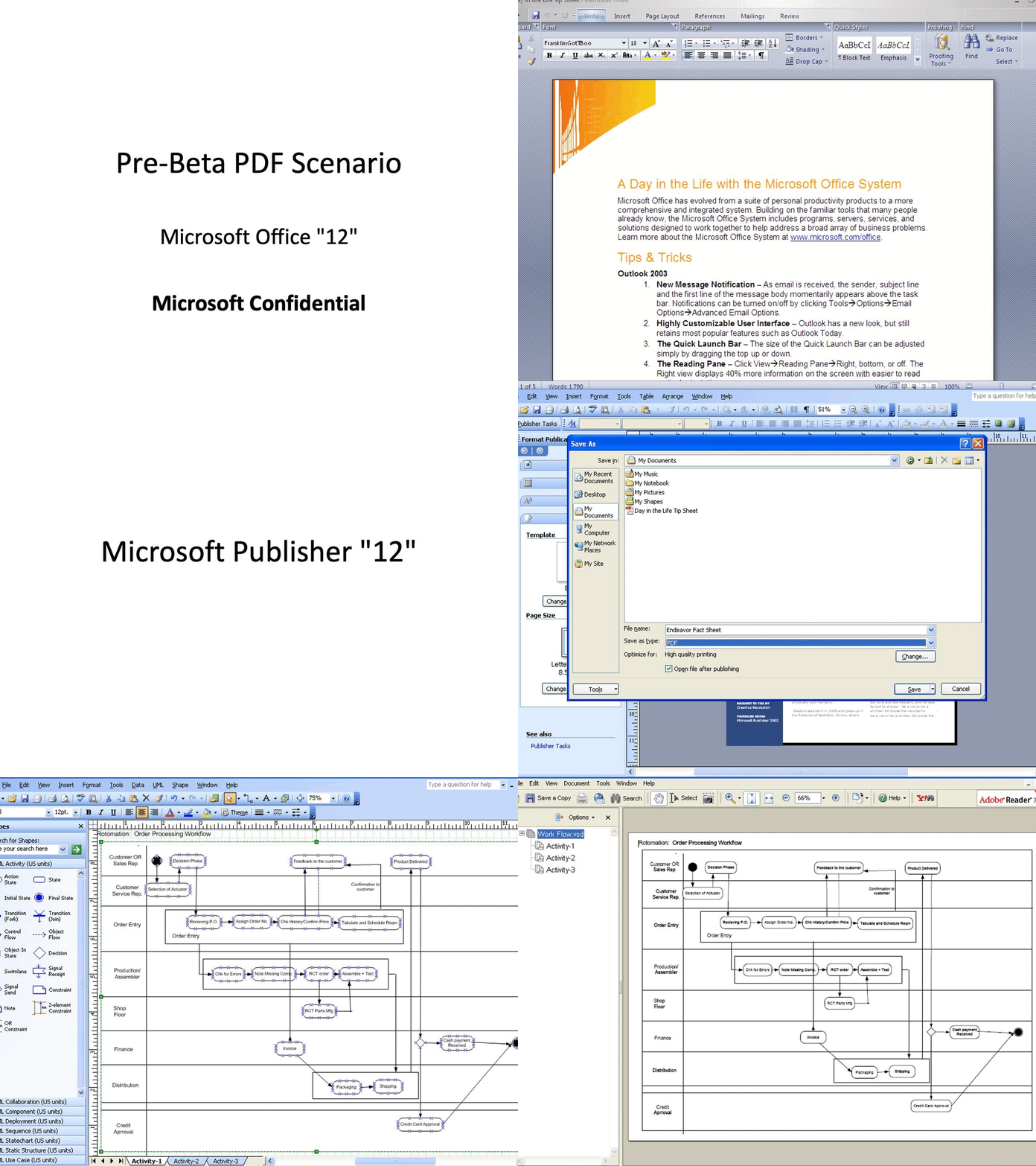
In today’s context this sounds supremely dumb. How could our best and most informed users get so excited over PDF? Today PDF is an utter commodity. Everyone uses PDF and no one thinks for a moment if it cost extra. Companies from DocuSign to Google and every institution from banks to hospitals and every government create PDFs and enable their customers to create PDFs. Every browser supports PDF. Every tool creates PDF. But in 2005, Microsoft alone was not in the PDF business yet the whole world was using Microsoft creation tools. It was a big deal, and the world was a silly place.
I then shared that the work was done by the Publisher team and they took on the work to implement it in all the Office applications. At the time, it was a remarkable maze (or thicket) of legal and regulatory challenges: a feature that our competitors supported, that utilized an open and published standard, and that was an entirely obvious customer need. We were receiving more than 30,000 comments per week on our own Office website requesting PDF support. The code was only half the battle. Would regulators view PDF as anticompetitive? Would implementing PDF in Office and not charging money for it be predatory pricing? What would Adobe think or even do? Would there be intellectual property challenges?
It was this last concern that kept us awake. A patent dispute claimed against Office got very expensive very quickly.
Adobe invented PDF more than a decade earlier. Recall, when I was working for BillG, the idea of creating viewable files was a key initiative passed on from my predecessor. Even before PDF, BillG did not want to do a file format that could not be edited and still did not. Adobe distributed a free PDF viewer on every computing platform, but to create PDF required a license, except on Steve Jobs’s NeXT operating system where it was built in (and thus eventually on Macintosh and iPhone too!). Over time, however, as the internet made PDF more useful, Adobe got pressure, especially in Europe, to make it possible for third parties to create PDF legally, for free. This was already happening, but technically such work risked violating the PDF license or intellectual property. Adobe, perhaps a bit too clever for its own good, published an open specification in a European standards body. We built our feature using only the open specification in a metaphorical clean room.
Adobe was extremely concerned by our support even though we relied exclusively on their open specification submitted to the European standards body.
Except we were Microsoft. Even our largest and soon to be most evil of competitors, Google, and our main Office competitor Sun, were using PDF to compete with us. In fact, the only way to print a document created with Writely, the browser-based word processor that would be acquired by Google, would be by outputting it to PDF which they announced shortly after this event. OpenOffice created PDF by a simple Save As command.
It was the peak period of fear and the assumption that everything we did had a potential for an evil twist, and as such the legal team was predisposed to capitulate to any regulatory skepticism by simply not shipping a feature. In fact, Save As PDF was completely benign and customer driven, but in the climate our motives were always questioned. Erich Andersen (ErichAnd), our fantastic head lawyer for Office, Alan Yates (AlanY) in marketing, and many others spent weeks briefing regulators, trade press, industry groups, standards bodies, and more, laying the groundwork for the feature. ErichAnd spent countless hours with his fellow Microsoft lawyers and those in the antitrust group convincing them we were on firm ground and delivering PDF was going to be OK when their reaction was to avoid regulatory scrutiny at all costs. Perhaps the biggest lesson from the regulatory era was that a company in a dominant position can’t always do the things that are perfectly acceptable with a lesser market position.
We were so worried that something might backfire in the antitrust or patent worlds that we designed the feature so we could easily remove it with a small update or reissue Office without the feature. If any party chose to litigate, it would not do so until after Office was commercially available to maximize the inconvenience for us and the damages owed to them.
Still nothing is ever easy, suddenly all those working hard to create or use our expanding XML file format were concerned we were sending a mixed signal to the market. XML was intended to support some of the scenarios PDF could, at least technically. The program managers working on XML authored a series of clarifying mails to be shared with the field on this topic. Under the hood, a key initiative for Office12 were the new XML-based file formats (the “x” in .docx, .pptx, .xlsx). These formats would eventually be published as open standards as well, a fact we also used to deflect any potentially conspiracy theories regarding our use of PDF.
One other wrinkle was that the Longhorn team was doing its own PDF competitor, called XPS (of course the X stood for XML in XML Paper Specification). We used the same code path we created for PDF to support also XPS. Peter Pathe (Blue) the VP leading the effort let the Windows team know we would support XPS, which they had previously pleaded with us to do. They were very excited to hear the news, but their excitement was considerably tempered by our additional support of PDF. Supporting both reinforced our claim as Office that we were trying to help customers by including multiple technologies.
We prepared an enormous package of briefing materials—all for a single feature. We had a whole media plan, Q&A with me on Microsoft’s main web site, a long set of RUDE FAQ especially over the Longhorn XPS format, and even a draft email to send to influential press and partners. It was a production.
Save As PDF was so popular that it quickly became part of the standard demo flow—a feature that exported a document out of Office, not into Office.
Save As PDF was very well done. We supported all the key features of PDF, such as accessibility, fonts, images, and more. Never had we done something so obvious and yet so difficult to release to market. The fact that the lightly resourced Publisher team delivered PDF was a special bonus, and development manager Ben Ross (BenR) did an amazing job. PDF support, through the work of people on the Publisher team like Cherie Ekholm (CherieE) in test and test manager Tammarrian Rogers (TRogers), also furthered Office efforts in accessibility and worldwide government standards.
We received emails extolling the virtues of Save As PDF from dozens of MVPs. It was so rare in a business of our scale to deliver something so immediately positive without cynicism or skepticism. The most elite members of the press from Walt Mossberg at the WSJ and Michael Miller at PC Magazine reached out to congratulate or mostly to thank us for adding support. PDF was crucially important to their workflows, and this made their lives simpler.
It is weird to think, but a feature that seems so dumb today was easily the most friction-free and joyous addition to a product I think I ever did, except maybe for the widget that counted compiled lines in Visual C++ that made everyone think the product was faster. Peter Pathe (Blue) our VP of Word and Publisher overseeing the work was equally happy, especially considering his own personal history in typography and publishing technologies, not to mention studying at the MIT Media Lab during the heyday of e-books.
A few weeks after the MVP conference, the Office technical beta was released. The MVPs received a lot of attention and were anxious and ready, and also feeling good about the insider scoop they received. This would be the first time anyone would have their hands on the code to use day in and day out—and the product was ready for that.
Once the Beta went out, we immediately began monitoring the private newsgroups (using the old NNTP protocol) the MVPs used to talk to each other—these newsgroups were the closed-door and NDA (non-disclosure agreement) meeting place for MVPs and part of what they valued most about the program. The product groups were on the hook to monitor the dialogs and respond to issues. The Beta proved to be the source of many emotional and heated discussions.
The good news was that these discussions were mostly the arguments we heard following the PDC. The MVPs were a slightly different crowd than the PDC developers. They were dedicating their careers to Office. They had a lot to discuss.
Almost immediately we were again (!) confronted with the feedback that the Ribbon took up too much of the screen. They were sending us screenshots of their customizations of Office—carefully removing much of the default user interface and relying heavily on keyboard shortcuts. To such a setup, the Ribbon was huge and wrong. Some showed us their dual monitor setups or how they arranged windows for multiple documents on a screen in skinny columns that did not work well for the Ribbon. Others had wide screens and sent us proposed renderings of the Ribbon oriented vertically on the screen to “save screen real estate.”
We recognized that many of these were personal preferences. We knew we were making a major change and major changes that undid knowledge of the most knowledgeable power users almost always received significant pushback. Through the course of this writing, I’ve shared several such stories such as the introduction of the new setup technology in Office 2000.
We filled our replies to the comments with data from our telemetry about how Office customers used the product: the screens they had, the number of toolbars and task panes that were routinely visible, and so on. At each juncture, the discussions devolved to a point that we were asked for options: options to move something around, hide something, or be able to change something. This was a normal reaction to change. Essentially, those resistant to change do not battle the change as much as request the ability to not experience it. . . to turn it off and go back to the old way.

Articulating that the redesign was a programmed user interface, like the cockpit of a plane, not a set of parts to be assembled, was our challenge—essentially rethinking the ancient design point of a customization-centric product. We changed the whole model and made it much more productive, and, in a real sense, moved the customer base (not only the hardcore technical users) to a higher level of expertise and mastery. We did this the very same way the graphical interface itself made software easier, by improving the abstractions. The graphical interface technology of pull-down menus with a mouse replaced arcane and seemingly arbitrary keyboard shortcuts of early character interfaces. The Ribbon replaced the user interface that essentially mapped every feature directly to an implementation and constant document debugging and futzing with higher-level abstractions that regular people could understand.
There was one raucous private newsgroup debate that came to symbolize the challenge of the thesis of operating at a higher level and even of the Ribbon itself. It started when one of the MVPs posted a message ranting, sorry raising the feedback, about “sub-second keyboard access.” The post explained that the reason the Ribbon wasn’t satisfactory was because it required the mouse, and what was needed was sub-second access to any command. MVPs often customized Office to provide unique and highly tuned access to commands. With the Ribbon this level of tuning was not (yet) possible. The MVP simply stated:
Advanced users have ***got*** [emphasis in original] to have convenient -- that is, sub-second keyboard access to all dialog boxes and many common commands. Without that capability, Excel 11 never will be uninstalled, because using it will be so much more efficient than using Excel 12.
As challenging (annoying, actually) as the comment could be interpreted, I resisted the temptation to immediately dive into the debate, as I was often impatient with this type of comment (threat) from insiders. I would forget to remind myself that while we had debated these very points for the past 18 months, the MVP was seeing everything for the first time. Instead, I commiserated down the hall with Billie Sue Chafins (BillieSC), one of the key program managers on Julie’s UEX team, reporting to JensenH. Billie Sue moved over to UEX from JeffO’s web services team where she was hired in the middle of the Office XP project. Like many (but not all by any stretch) program managers, she was a trained computer scientist, having put herself through school after moving from rural Kentucky, where she was born and raised. Unlike most program managers, Billie Sue was also a teacher, having been a university lecturer of computer science before heading to Microsoft. As a key member of the UEX PM team she was in a perfect spot to drive engagement with the MVPs who were extremely interested in the Ribbon. Billie Sue kept an eye out for hot issues and made sure the team was handling the traffic.
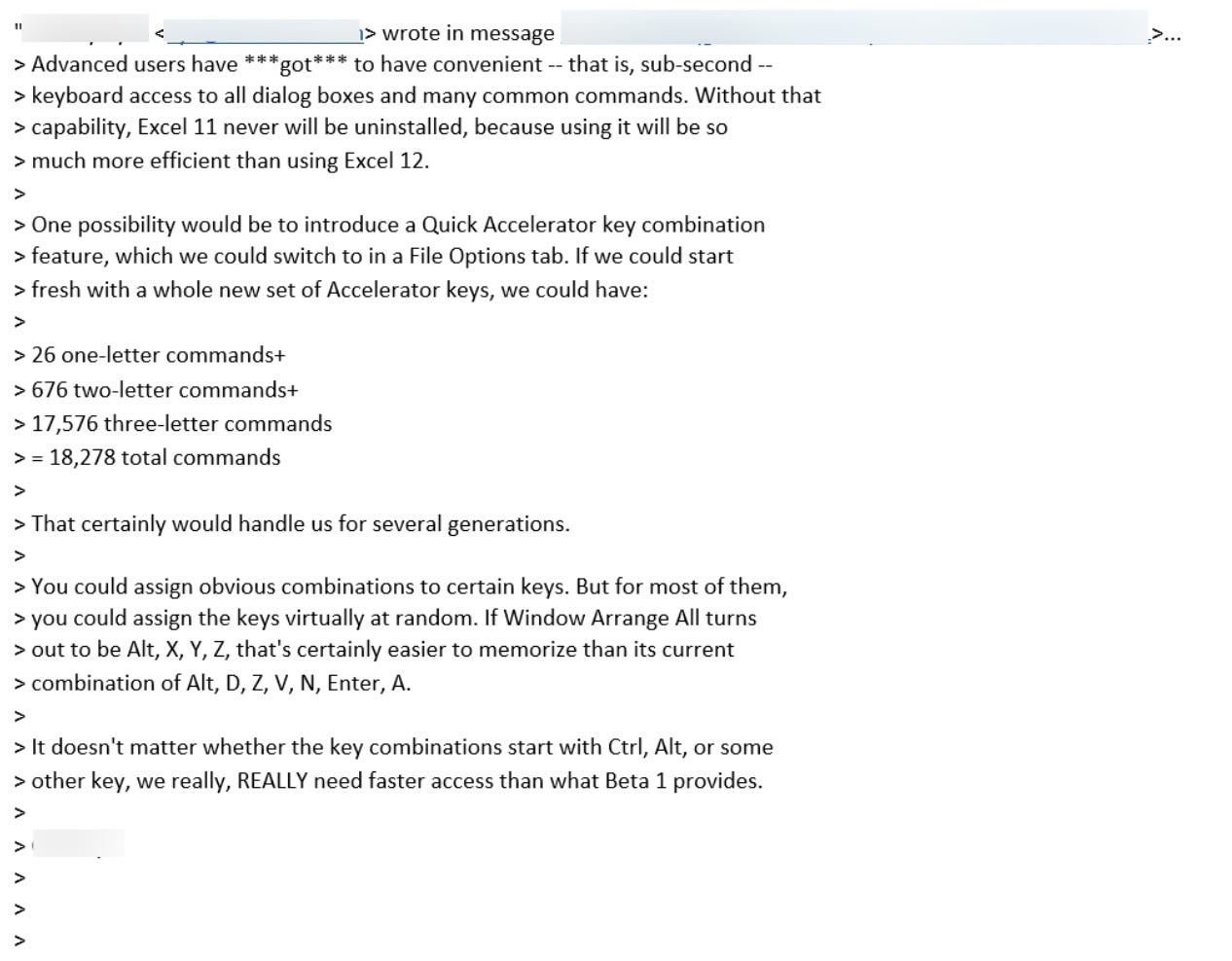
The “sub-second keyboard access” feedback stumped us. Once when I stopped by her office, we looked at each other trying to understand what that could possibly mean, because no one could type and execute commands that quickly. She knew debating the premise of his question would be futile. When forum participants smelled weakness, a pile-on followed. Suddenly, everyone needed “sub-second keyboard access.” Billie Sue drafted one of many responses on the thread and eventually provided enough data on usage, customization, and more to at least explain why the design worked.
The larger point she made was how the design committed to providing full keyboard access to all the commands, without having to customize the product to do so. In fact, part of the innovation of the Ribbon was to make sure everything was accessible via the keyboard. In addition, she pointed out that existing keyboard shortcuts remained compatible and customizable. This thread gave Billie Sue the opportunity to acknowledge the feedback and commit to improvements. We already planned on having full keyboard access. We just did not have it in the technical beta.
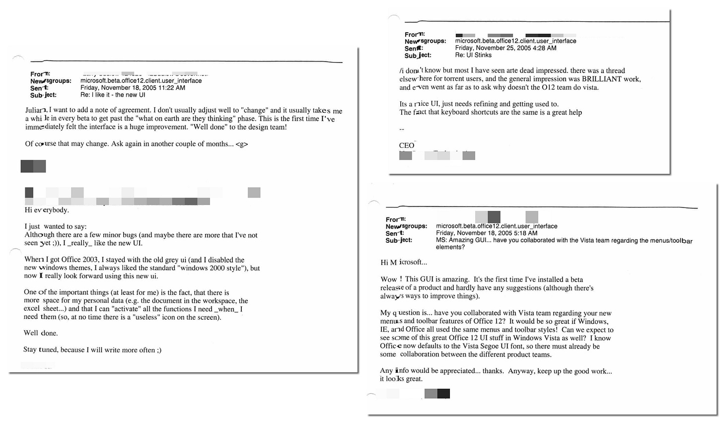
For every “sub-second” post, however, there were many threads not only defending the Ribbon and experience but calling it brilliant. Some of the more entertaining, if not parochial, comments asked if the Office team might go over and help the Vista team out. More on that later.
Customization continued to be a topic in the newsgroups simply because the MVPs were the people who customized the product the most. The data we offered showed how few people customized (or how often customization happened by accident and could not be easily undone), but there was no telling that to an (or the) audience of customizers. Experts always want customization options, but options have an enormously high cost in the short and long-term that impact customers as much as Microsoft. This is especially true when it comes to customization of user interface—something we were freshly experiencing as we worked to fully support the customizations that developers had become used to for creating custom applications hosted within Office. What doesn’t make the product too complex today, will certainly make the product more complex tomorrow when the combinatorics of all the various customizations conflict with each other. What always seems like a simple preference or switch turns into a testing and compatibility matrix from hell.
We were in the earliest stages of the design of what we thought of as a customization escape valve, a place for those strongly committed to customization or, frankly, where the usage model was so far from typical. The Quick Access Toolbar (QAT) was a row of buttons that could be turned into any command from anywhere in the product. The MVPs could have full customization control over this feature. I admit to forcing an expansion concept of the QAT on the team for the power user customization scenario. It was kind of ugly and broke the model, but it was also a life saver with a specific set of customers. The brilliance of how the team designed the original QAT was how minimal the impact was on the overall Ribbon model and design.

The QAT, which is the tiny little row of buttons at the top-left of the title bar (at least through Office in 2021), had buttons for Save (the classic disk icon), Undo (the back arrow), and Redo (the forward arrow). The QAT was meant to have the very top used commands always accessible regardless of what part of the Ribbon was visible. We were so worried about how dumb it might look for Save (of all things) not to be visible since it was from the first toolbar, that it was placed in the QAT. Much to the disappointment of HP, printing began its slow decline in the early 2000s and given the telemetry it was not on the QAT.
Surprisingly, none of the participants, so many well versed in history, drew the analogy to a feature in Macintosh Word called the Work menu (I believe going back to version 3.0 in 1987, the second Macintosh version), which was precisely the same idea—a menu that could be customized to contain any command in the system. Sometimes what is (very) old becomes new again and is even better when its reemergence goes unnoticed.
In the very early days of Excel, a command called “Set Print Area” was moved off the File menu and it immediately jumped to the top of the customer support call issues (today this command is mostly automatic, but also readily available in the Ribbon). Fast forward to 2007, JulieLar and I were invited to join with a Harvard Business School executive education session being taught a case study on the user-interface redesign. The students were asked to prepare their notes for class using brand new Office 2007, which none of them had yet been using given the pace of corporate deployments. As soon as class started a student/executive raised their hand and asked Julie “How do I print?” as the rest of the class groaned in support. The omission of a Print button on the initial QAT might have been the biggest oversight of the entire project. It was certainly an embarrassing moment.
The beta was solid enough that thousands were using it every day, and it was clear more of the product was getting used, quality was high, and we were on a path to finish. This, however, was the technical enthusiast audience.
Our next step was a broad release, including the core business users, specifically IT managers, who generally didn’t react well to change and could be very vocal about it. The press and reviewers would also be testing out Office12 and most of them used Word and Excel for hours every day.
On to 082. Defying Conventional Wisdom to Finish Office
https://web.archive.org/web/20060110150058/http://blogs.msdn.com/jensenh/archive/2005/09/15/467956.aspx


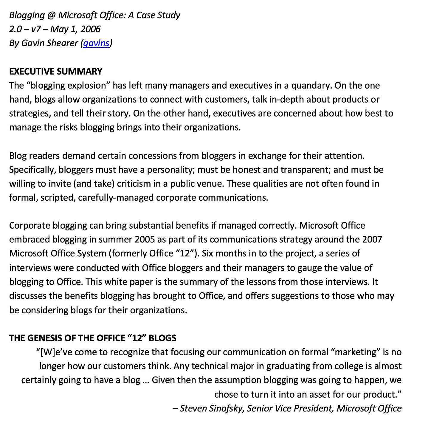
I remember flying to the Bay area with Julie to demo the Ribbon to Jakob Nielsen and Don Norman individually...in their homes! Both were skeptical, but cordial. Jakob clued into the value of 'results oriented UI' immediately and then turned that into an opportunity for himself. He took that article and turned into a series of paid workshops.
Don was most intrigued with the 'UI Effect' chart featured in the post 80. First, he credited us with admitting the dip in productivity and not just glossing over that reality. Second, he was skeptical of the increase in productivity until we demo'ed the ease of formatting with the gallery control. It was immediately evident the number of mouse clicks that saved and he looked somewhat deflated that we could indeed claim an improvement in productivity.