
078. A Tour of “Ye Olde Museum Of Office Past”
“What'll Mac products be like ten years from now? This much I know: Word will have still more icon bars…” —David Pogue, MacWorld, February 1994

Welcome to “Ye Olde Museum Of Office Past.”1 This section is one of the more deeply product-focused of Hardcore Software. I hope to make it fun. In this section, I will go through the history and evolution of the Office user interface. While there were numerous innovative user interface systems and approaches across the industry, what we developed in Office by virtue of the breadth of usage and position of influence was viewed by many as a standard to be followed. Many readers have experienced the innovations discussed here. By stepping through over 20 years of user interface designs for Microsoft’s word processing applications, we can see the dedication to solving problems. We can also see the creeping introduction of bloat.
Back to 077. What Is Software Bloat, Really?
How did we get to Office 2003 with a menu bar, toolbars, context menus, keyboard shortcuts, task panes, dialog boxes (with tabs), widgets, buttons, and pop-up commands?
We got here by solving customer problems. We got here by making the product easier to use. We got here by listening to the market. We got here by winning reviews. It was that simple.
Or was it?
It is easy to see what happened in hindsight. We added new features, one after another. To make features easier to discover and use, we added additional user interface. Layer after layer, or solution after solution, we built up an array of user interface elements that when looked at in totality created bloat. But it is just so easy to say that in hindsight.

One simple observation was that to win in the market when Microsoft started making applications, we had to win reviews. These reviews meant everything in a world with many competitors, retail distribution, and little word of mouth (and no internet). Reviews were giant checklists of features. For example, Software Digest compiled yearly reviews of all products in market. The 1984/5 edition of their 200-page book on just word processors had a 4-page fold-out checklist of 50 features and a dozen abstract criteria. Fail any of those and the overall score sank. A losing score meant no ability to advertise winning, no recommendations from salespeople, and then the next release and review started in a hole. So, for a decade we made sure to always have those features. There was no choice other than to win reviews. And we did.
When should we have stopped and taken a first principles approach? When would the upside have exceeded the potential downside? When would the market and reviews have tolerated a big change? What if the market rejected a solution we tried? We would have reverted to the old way and delayed addressing bloat for how long, another decade? It drove me bonkers when people thought bloat was obviously caused by too many features. It also drove me bonkers when those that should know better would so quickly conclude that we were making things worse by winning reviews.
There is no easy answer to asking when the right time is to make a wholesale change in approach. Anyone in product development saying it is obvious hasn’t really lived through the risk of making a bad choice or is simply applying hindsight.
Innovator’s dilemma and disruption make it seem so easy to identify and act at the right moment. They also make it so easy to make fun of the leaders who are terrified, I mean literally shaking scared, to make a dramatic change to a product. No one ever gets fired right away for not making a big change. Many people get fired right away for making a big change at the wrong time. The worst part? So many big changes are eventually proven correct over time.
In the case of evolving Office, we were going so fast cranking out releases no one stopped to ask anything big. Customers were buying our product as fast as we could press new CDROMs, so to speak. We were winning reviews. Our biggest competitor was ourselves. We were so ubiquitous that we were punchlines on everything from David Letterman to Saturday Night Live to Dilbert.
 It was true: the programs of Microsoft Office (Word, Excel, PowerPoint, Access, Outlook) seemed as permanent in our lives as the sun, the moon and Windows error messages. Its rivals -I,B.M.'s Lotus sulte and Corel's WordPerfect suite, for example - were pretty much the same thing for pretty much the same price, and never posed much of a threat. The world waited for a contender that was so compelling, peo- ple might actually consider filing for Micro- snit divorce Now there is one. It's called OpenOffice, and it has a killer feature: it's free. Like Microsoft Office, OpenOffice - whose official name is OpenOffice.org 1.0- comes with a word processor, a spreadsheet program and a slide-show program. It lacks Web-page editor. Amazingly, all this fits in a 50-megabyte download from www •openoffice.org. You have your cholce of 27 languages and three operating systems: Windows, Linux or Solaris. (A Mac OS X version is in the works.) How could such a sweet sulte be free? OpenOffice is what's called an open-source project: a carefully orchestrated group ef- fort by programmers all over the world, do- nating their time and talent to making a dent in the Microsoft monopoly.")
Then suddenly, we were boring, bloated, and not particularly interesting. So much so that a buggy, poorly implemented, sort-of clone became a symbol of everything we had apparently done wrong. The world was saying that StarOffice was good enough. Ugh. Our sales, however, were not dented even the slightest. But could they be? We did lose that deal in one city in Germany. StarOffice was a German company so maybe it wasn’t so bad. Then there was a medium-sized US government agency loss. When do you panic when something like this happens? There’s no playbook.
Hemingway wrote in The Sun Also Rises:
     "How did you go bankrupt?" Bill asked.

"Two ways," Mike said. "Gradually and then suddenly."We became bloated gradually, and then suddenly it was too much. The product was collapsing under its own weight.
It was time to revisit from first principles everything we’d done and ask why. And to come up with a better approach, a wholesale reinvention.

The aim of this section is to briefly cover the history of those innovations that got us here so that we have the necessary context in the next sections on the design of Office12. When it came to telling the story of Office12 once he showed it to customers, Jensen Harris (JensenH) dubbed this his tour of “Ye Olde Museum of Office Past.” Please join us on a tour.

Comparing a typical command in Office from the time it was introduced to a release decades later is a great lesson in the compounding complexity of products. Making text bold debuted in Microsoft Word 1.0 for MS-DOS in 1983. Text was made bold simply by selecting the text (actually, it wasn’t simple at all since few had a mouse, but I digress), hitting the escape key, the letter F for format, the letter C for character, and finally the letter B for bold. For those with a fancy monitor, which not everyone had at the time, the text became bold on the screen. Choices at each step were limited to approximately five.

Commands also had keyboard shortcuts from before the mouse as an affordance for touch typists. Early keyboard shortcuts were simple, like using INS(ert) key to copy text from the scrap (clipboard). WordPerfect, and other early MS-DOS apps, devised schemes that were nearly impossible to memorize. Most people had some sort of cheat sheet nearby or keyboard overlay to help remind them of keyboard sequences. Lotus 1-2-3 had a highly structured command architecture known as slash commands as navigating the character-based menus began by striking the forward-slash key (for example, to open a file /WFR for slash, (W)orksheet menu, (F)ile menu, (R)etrieve command). Competitively, the two behemoths in productivity software of the MS-DOS era, WordPerfect and Lotus, arguably clung to their keyboard methods while the industry shifted to the graphical interface, even maintaining compatibility with those keystrokes during the rise of the mouse and standardized menus.
, the MacWrite program gives you access to its man word-process- ing features through a col- lection of pull-down menus selected from the bar at the top of the screen. For instance, the display on the facing page shows the cursor in position to select the File menu. Stule Plain Text #P Bold vItalit aI Underline ¥1 vOutine 我0 Shadow #S File NeW Edit Close... Save... Print.. Quit The File menu encom- passes all file-controlling commands. Foul Toot Undo Cut Copy Paste 94 我厂 9I 9 Point 17 Point 14 Point 18 Point /24 Point 76 Point 48 Point 77 Pnint Show ScraoBook The Edit menu lets vou move text by cutting a sec- tion out, storing it on the clipboard, and pasting it in another location. In most instances, you can undo last smman MacWrite's Style menu lets you alter the type size and style of vour text. The type in anv font can be made bold, italic, under. lined. outlined. and/or shadowed, and an impres- sive range of type sizes is available Cursive Old Enolish City Ransom Querbrook Sustem Rosemont Ardmore /Merion The prerelease version of MacWrite we tested offers nine different fonts in- cluding display type. About MacUrite.. Calculator Clock Keu Caps Puzzle NotePad ScrapBook Control Panel System utilities are selected from the \"Apple logo' menu. Format Insert Ruler Hide Rulers Show Header Shot Footer Set Page #... Insert Page Break Title Page MaWrite's Format menu works with the icons described on the facing page to control the an- pearance of your text. Search Find... Change... Searching and replace functions are accessed via the Search menu. The MacWrite display below shows format specifications | ruler let you choose single-, 1½, or double-spacing, and and type samples. The menu bar is at the very top, and the four on the right set text flush left, centered, flush the line below it gives you your current file's title. The right, or fully justified. Again, all you do is use the ruler lets you mark left and right margins (solid triangle icons), paragraph indent (vertical arrow icon), regular 'porten arenate what choices and the wilt aide morts tab (open triangle icon), and decimal tab (dotted triangle like an elevator up and down the gray column to indicate ire o prop tale Yoon and aragit to ha de streapont on where you are in your document (you can jump across hundreds of lines by sliding the box with the mouse). the ruler. The three rectangles in the center below the The nine fonts and six type styles are also shown. File Edit Search Format Fonts Stule Untitled 13 5 16 Macintosh Matintosh Macintosh Macintosh macintosh Macintosh Macintosh Macintosh Macintosh Macintosh Macintosh Macintosh Macintosh macintosh macintosh Mara 1084 Donular Comnutino")
Macintosh, with menus and a mouse (and later Windows), aimed to simplify all this. In Microsoft’s Word 1.0 for Macintosh, text was selected with a mouse and Bold was chosen from the Character menu, like what Apple did in their MacWrite 1.0. MacWrite had about 35 menu commands in total. Menus were mostly a direct mapping of the features to the product code. The whole product could be described by showing screenshots of all the menus in a two-page magazine spread as Popular Computing did in 1984 when Macintosh was launched.
Over time more and more formatting options were added: subscript, superscript, underline, different fonts, color, and so on. Excel was even more complicated because it supported formatting cells as dates or currencies, plus single underline, double underline, accounting underline, and more. This was great—we listened to customers, observed what they were trying to do in the real world, took advantage of new hardware, such as laser printers, color ink-jet printers, and fancy screens, and were adding features like mad. Soon, though, the menus got too long for even basic formatting.
")
Microsoft’s early Macintosh applications introduced dialog boxes, which were windows that popped up and showed all the formatting options. This was inconvenient for routine formats, so the menus had a mixture of common commands like Bold and Italic, and then a menu to “bring up that complicated dialog box.” This was the start of hide-and-seek with features.

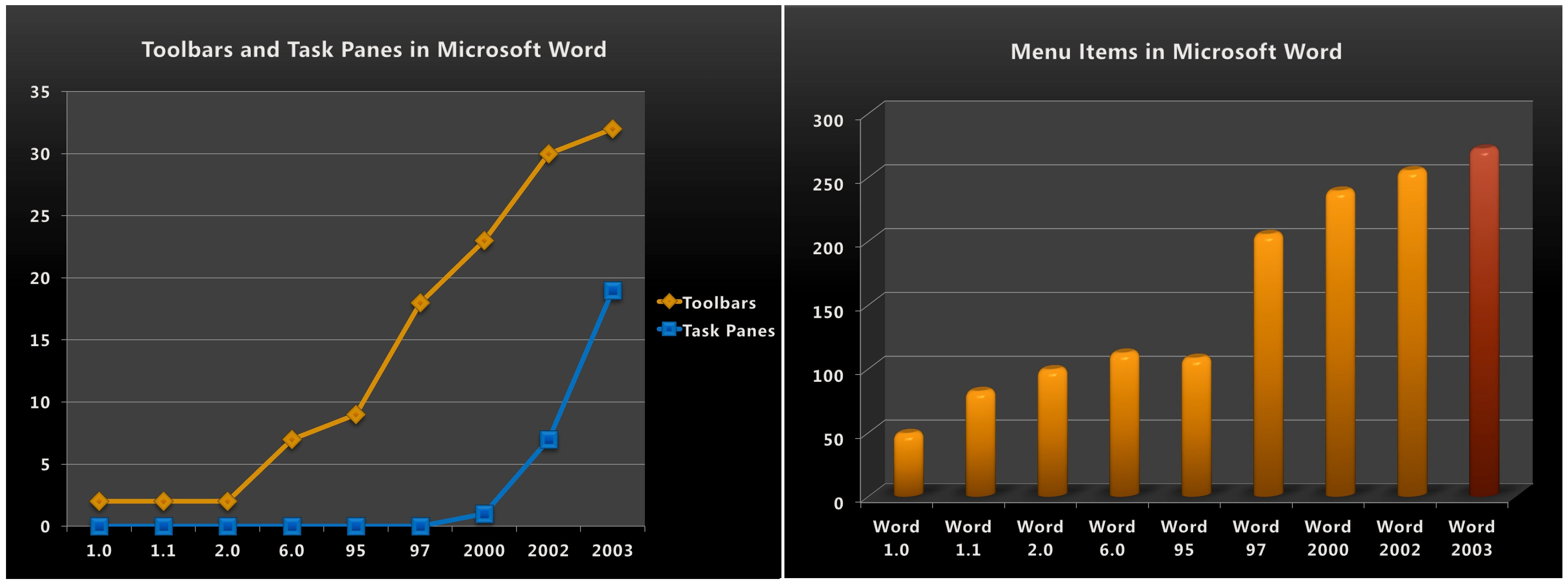
Excel realized these challenges about the same time Microsoft Publisher did and created toolbars. (There’s a history of debate over toolbars—what is considered one, and which team or even company invented them. Many on the Excel team were hardcore about their version of the story.) Toolbars were used for common commands, like Bold and Italic, as well as Print, Save, and Copy. In 1990, the front of the Excel 3.0 box and associated advertising displayed giant toolbar with buttons for Bold and Italic. Toolbars they were such a big deal. Eventually, toolbars were so popular everyone wanted their favorite commands on them, so we created more toolbars and made it easy to rearrange the buttons and hide/show different toolbars.
 Common screen resolution: 640x480 Number of toolbars: 2")
Under development at the same time as Excel 3.0 was Word for Windows 1.0, Microsoft’s first word processor for Windows (I’m omitting the venerable Microsoft Write included with Windows, which by the standards of MacWrite was every bit a word processor). Word for Windows also had toolbars, two of them, and a graphical ribbon which was the defining user interface element in word processors, owing to the skeuomorphic interpretation of the margin scale of a Selectric typewriter. Word 1.0 also fit on a screen 85% the size of today’s HD television.
 Common screen resolution: 640x480 Number of toolbars: 2 User Interface Additions: Nested Dialog Boxes")
Word 2.0 released in 1991 nearly doubled the number of buttons on the toolbars but maintained the same layout and screen dimensions. While each iteration showed substantial gains, the transition from Word 1.0 to 2.0 marked a move from character to paragraph and document-level operations in the main user interface. There were now buttons for inserting tables, columns, charts, and graphics/shapes. The addition of inserting charts, for example, represented the rise of Office-wide technology connecting the applications which was strategically important even if not every customer used the features. Each of these features represented more than single attributes on a character. For example, adding a numbered list encompassed indenting the paragraph, an automatic number, hanging indent for multiple lines, and spacing after the list. These steps could have been executed manually but getting them right each time was error prone, assuming one could get it right the first time. As each of these features were more complex, Word introduced dialog boxes that had buttons on them to summon further dialog boxes, or nested dialogs. This really led to the creation of “where is that?” within the user interface. Designers and program managers worked enormously hard to position choices and options within these nested dialogs, but no user maintained this level of conceptual knowledge of the product. What was the problem we were solving? There was literally nowhere to put all the new features. Menus and toolbars were constrained by working on screen resolutions typified by 15” CRT monitors or first-generation laptops.
 Common screen resolution: 800x600 Number of toolbars: 8 User Interface Additions: Right-click contextual menus Tooltips Tabbed dialog boxes Toolbars on bottom of screen Wizards")
By Word 6.0 the race was on (the version number skipped from 2.0 to align with the ongoing MS-DOS version of Word which accelerated its version number to align with share leader WordPerfect—yes that’s how the industry worked). Word 6.0 was a breakthrough product, even more so when brought together with Excel 5.0 and PowerPoint 4.0 as Office 4 in 1994. At that time, Office 4 was a monster of a product as no company had competitive products in all the major categories. Within the categories each Office application was at least tied with the nearest competitor. Office 4 was the last release entirely designed for individuals as the product was quickly becoming a standard business purchase.
That said from a design perspective, the relative heft was obvious. Word 6.0 added 6 additional toolbars and a host of new user interface affordances for accessing commands, while also increasing the baseline screen size by 25%. Word (and Excel and PowerPoint) added right-click contextual menus, tooltips, tabbed dialog boxes (a refinement of the nested dialog boxes), toolbars on bottom of screen, and wizards. What was already a difficult to master set of commands accessible by one action (point and click) became acts of hunting and discovery. Tooltips, helpful text explaining what a graphical toolbar button did, popped up when the mouse was hovered over a button. Some toolbars only appeared when invoking certain features (though they didn’t always go away).

Right-click context menus are worthy of some historic context. Paul Allen (PaulA) Microsoft’s co-founder was a huge fan of the right-click, drawing his inspiration from the original Xerox SmallTalk when he created the first Microsoft Mouse with two buttons. Steve Jobs rejected two buttons in favor of a simpler Macintosh mouse, and for years bemoaned the use of the secret Ctrl+click added to Office applications, simulating right click. Windows had not entirely caught up with its use of right-click but with Office 4, Apps added right-click with abandon. With right-click, relevant commands for a character, a selection, a picture or even a paragraph appeared by right-clicking the selected object. The laudable goal of these commands was that by carefully curating the user-interface the right commands would be available and there would be no need to cruise around the product to figure out what might work. The menus were called context menus for this reason. The feature was marketed heavily, so it was no surprise that sometimes we snuck commands in the context menu that were important strategically, though not always the most likely to be used.

We had our early usage telemetry for Word 6 that came from a specially coded version and data collection via floppy. I vividly recall the data coming back about context menus showing they were frequently used. I shared this data with PaulA who was active on the board still. It was quite a vindication of the two-buttons. The more fascinating datapoint was that for a typical command such as copy/paste the usage of the menu, toolbar, keyboard shortcut, and now context menus were split roughly evenly. A given user did not exclusively stick to one affordance. We learned early on that adding secondary and tertiary affordances to commands was a convenience picked up by a set of users, not a replacement for the old ways. Importantly, and reviews showed this, technical users heavily bought into the notion that user-interface should be available multiple ways for maximal efficiency. While we curated and designed the context menus, it was no surprise that these same technical users wanted to customize context menus because they had their own ideas for what might make sense. The popularity of context menus put pressure to add even more commands over time, eventually obscuring content or forcing awkward positioning on small screens.
It was always the case that menu items that were not applicable at a given time were disabled or greyed out. As commands and buttons began to encompass high-level abstractions, disabled commands started to become a mystery. Why couldn’t I insert a table inside a table? Why didn’t bold work on a chart? And so on. This proved even more frustrating than hide-and-seek. These “greyed out” commands aways seemed to be needed just when they didn’t work. People had no idea why a command was greyed out. Even today searches for “Word menu item greyed out” have hundreds of millions of results.
 Common screen resolution: 800x600 Number of toolbars: 9 User Interface Additions: Red-squiggle spell checking IntelliSense (\"Auto\" features)")
Recall that the design of Word 95 (technically Word 7.0 for Windows 95) required we not change the file formats. This significantly constrained what features could be done since most formatting and document commands would result in a file format change. Word 95 innovations were mostly focused on IntelliSense, features that just worked with little if any user interface. We previously discussed background spelling and AutoCorrect as examples of these features. While the product did not gain bloat by way of pixels, the sense of product mastery was reduced. IntelliSense features introduced us all to “what just happened” when using the product. Typing a few dashes across the screen and pressing return yielded a clean horizontal line. Pressing backspace was a clever way to undo that so long as that was the next key pressed. This loss of control or as we now know an inability to fully master a product came about by the introduction of features specifically designed to be useful without having to learn a command. Hundreds of hours went into designing interactions such as how to begin and end a bulleted list (using an asterisk or hyphen at the start of a paragraph to begin, and a second return to end a list). Even with a dedicated effort, we could not be right 100% of the time. We began to consider the hypothesis that automatic features might need to be so perfect that they worked 100% of the time, and if we guessed wrong just 1 time out of 100 then to the user the feature was always wrong. Think about this in the context of today’s iPhone AutoCorrect.
 Common screen resolution: 1024x768 Number of toolbars: 18 User Interface Additions: Toolbars on every side of the screen and floating Menu bar can be docked on any side of the screen or floating Drag and drop any command anywhere Office Assistant (\"Clippit\") Hierarchical, multi-level menus Hierarchical, multi-level context menus Icons on menus and context menus Green-squiggle grammar checking Increased IntelliSense (including on-the-fly spell correction)")
Word 97 was the first release using shared code across all of Office for deep architectural features. One of those features discussed earlier was command bars, our first shared code for this critical user interface affordance. The availability of shared code and ample time to develop new features led to an explosion of command surface area in the product. Thanks to 32-bit computing and Windows 95, the base screen resolution expanded to 1024x768, three times bigger than our original target for Word 1.0. An explosion in user interface correlated to the product being labeled a winner, a juggernaut, and competitively overwhelming. But it was not bloatware, yet. Just by toolbar count, the product was twice as big, jumping to 18 toolbars (and each one had more buttons because of the screen size). For completeness the list of new user interface widgets included: toolbars on every side of the screen and floating, menu bar that can be docked on any side of the screen or floating, drag and drop any command anywhere, hierarchical and multi-level menus and context menus, icons on menus and context menus (the preceding all came as part of the new shared code), Office Assistant ("Clippit"), green-squiggle grammar checking, even more IntelliSense (including on-the-fly spell correction), along with more wizards and more multi-function commands on toolbars.
IntelliSense in Office 97 was as much a point of view as it was code in the product. Some of what was designed as IntelliSense was trying to do the right thing with the user interface elements that routinely appeared. We would try to anticipate needing some functionality and pop up the user interface. Often this puzzled the user, and they would quickly move it out of the way. The obvious addition was a check box “Never show this to me again.” The significant problem with this option is figuring out when to show that user interface in the future. If we guessed and showed it again, we were ignoring the user choice. Absent that, the chances of a user finding where to uncheck the checkbox they just checked were slim. The chance of even knowing that is what was required was probably zero. In other words, whatever we popped up was effectively gone forever. This type of intelligence in the design proved to be incredibly frustrating. I’d offer a tip for readers that are designing products: a checkbox offering to never show something again is always a bad idea (GDPR inclusive). Showing it in the first place was the problem.
Word 97 was both our last release aimed squarely at the retail consumer and technology enthusiast and our first release with an eye towards the volume purchasing business customer. It was also the last release that was done without thinking deeply about the impact of complexity on corporate customers. In hindsight it is probably right to look at this release as the start of an overwhelming Office but only because customers would soon be pointing to Office 97 as bloatware. At the same time, by today’s standard the set of features and capabilities were not at all overwhelming, just ahead of the curve for most people. For example, PowerPoint dramatically added photo, drawing, and graphics capabilities which also appeared for charts in Excel and drawings in Word. It is entirely clear these are representative of mainstream scenarios today.
 Common screen resolution: 1024x768 Number of toolbars: 23 User Interface Additions: Personalized Menus (short ->long expanding menus) Default toolbars \"rafted\" onto a single row Toolbars buttons show/hide based on frequency of use SDI: One window on taskbar per document Free-Roaming Office Assistant Helo Pane")
Hearing the early concerns of complexity and bloat from our new enterprise customers deploying Office 97, we looked to a cosmetic/graphic design approach to reducing bloat. Along with the enterprise feature set in Office 2000 we employed the use of the doctrine of “make it simple by hiding it.” We used our command bar infrastructure to implement the personalized menus, where commands were hidden by default in both menus and toolbars. This was detailed in Chapter VIII (Alleviating Bloatware, First Attempt). The feature proved a failure and would be an important part of informing our design for Office12.
In another visual trick, we used the space made available by hiding toolbar buttons by default to place the two main toolbars adjacent to each other rather than on top of each other, called rafting. The contextual toolbars introduced in Office 97 described above were further tuned so they would hide and show automatically in the hopes of returning some control to the user.
I’d offer another tip for readers that are designing products: invisible and hidden commands are in no way at all simpler or more streamlined, though they are frustrating.
The Windows team encouraged us to change our apps to have one distinct window for every open document, with each window showing up on the Windows taskbar at the bottom of the screen, a design long-standard on Macintosh. Previously only the application showed up on the taskbar and multiple documents for the same application were available as separate windows only through the application’s Window menu. This was deemed complicated and not consistent with the direction of Windows. The result especially for Outlook was a ballooning in the number of windows on the taskbar each with ever-decreasing amount of text showing the title as they were cramped together. In other words, a change meant to make things easier turned out to scale particularly poorly when applied to real-world application usage.
By the time we shipped, Word 2000 added five new toolbars.
![Microsoft Word 2002 (2001) Common screen resolution: 1024x768 Number of toolbars: 30 Tupe a question for helo 三洋重至 New Document Open a document Contemporary Memo ReadMe Readme D More documents... New 19 Blank Document W.] Blank Web Page M Blank E-mail Message New from existing document 191 Choose document... New from template Elegant Report mi General Templates... • Templates on my Web Sites... Templates on Microsoft.com -Ex X X User Interface Additions: Task Panes (8) On-Obiect UI: Paste Options On-Object Ul: Undo unwanted "Auto" actions Smart Tags: Pink-squiggle recognized words "Type a question for help" box](https://substackcdn.com/image/fetch/$s_!ERoB!,f_auto,q_auto:good,fl_progressive:steep/https%3A%2F%2Fbucketeer-e05bbc84-baa3-437e-9518-adb32be77984.s3.amazonaws.com%2Fpublic%2Fimages%2Fe6a6b876-4751-486a-990a-c6ddba97fcd5_1440x1080.png "Microsoft Word 2002 (2001) Common screen resolution: 1024x768 Number of toolbars: 30 Tupe a question for helo 三洋重至 New Document Open a document Contemporary Memo ReadMe Readme D More documents... New 19 Blank Document W.] Blank Web Page M Blank E-mail Message New from existing document 191 Choose document... New from template Elegant Report mi General Templates... • Templates on my Web Sites... Templates on Microsoft.com -Ex X X User Interface Additions: Task Panes (8) On-Obiect UI: Paste Options On-Object Ul: Undo unwanted \"Auto\" actions Smart Tags: Pink-squiggle recognized words \"Type a question for help\" box")
Office 2002 (aka Office XP) aimed to vector some efforts back to delivering end-user features. With the failure of the Office Assistant and Clippy’s retirement due at the time we shipped, we introduced two features aimed at offering ease of use surface areas. In hindsight, both were poor choices, one of which continues even today (after being removed from Office12).
The first relatively minor change was to make our new internet-connected help system available all the time with a simple “type your question here” box at the top of every screen on the same level as the menus. This rather innocuous addition set a precedent of cluttering the menu bar for additional commands. The awkwardness of the affordance as a place to type questions made it a particularly poor choice. Typing in the menu bar is just weird.
The task pane described in Chapter IX allowed us to greatly expand the surface area of the user interface. The design choice was rooted in the rise of the web. Unlike menus and toolbars which are concise word-length command descriptions, the web evolved with sentences describing the steps, such as “After selecting your dates of travel click here for the best fares.” Many on the design team favored moving Office to a more descriptive user interface as a way of reducing complexity and explaining actions in context. The task pane started as an experiment for a few key long-standing problems. The “New Document” task pane finally gave us more room for the user to choose from a list of previously opened files, document templates, and more. The “Reveal Formatting” task pane was an advanced feature long favored by technical users which showed all the formatting applied to a given selection of text (historically this was also a feature to compete with WordPerfect).
The task pane would prove to be a frustrating experience for customers, especially on small screens where it took over a good chunk of the side of the screen. It is worth noting that laptops had started to switch to wide-screen format (16:9 aspect ratio)—screens remained about the same height but were wider to accommodate a standardized HD (720p) and Full HD (1080p) resolution being used for video. Theoretically the wider screens would offer more space for user interface arranged vertically. Tech enthusiasts became enamored with the idea of stacking the Windows taskbar on the side for this reason. Feedback was mixed. At the very least a large portion of our enterprise customers were still using standard 4:3 aspect ratio screens.
In total, Word 2002 created eight task panes and added another seven toolbars, bringing the total number of toolbars to 30. Task panes were a key part of marketing Office XP, exceeded only by Clippy’s retirement.
 Common screen resolution: 1024x768 Number of toolbars: 31 User Interface Additions: Task Panes (11 new + 8 existing = 19 total) Person Name Smart Tag Menu ALT+ click words to perform lookup actions")
Office 2003 as described in the last chapter was characterized by heft. We delivered more new “programs” than in any prior releases, plus services and servers—the entire Office System. The expansion of the user interface continued as well.

The task pane from Office XP proved extremely popular, even considering the feedback from Office XP. We believed that the continued standardization of wide screens would show that using the task pane for user interface was a good use of the extra width. We added 11 (yes, 11) new task panes bringing the total number of task panes to 19. The task panes received a technology improvement adding support for more user interface elements and richer display. The task panes themselves were essentially mini-web sites within the product.
We didn’t stop there. We added a second window aligned on the side for showing online help which would cause a jarring realignment of the whole application shifting everything to the side to make room.
Looking back at each of these releases one other point is worth noting. Each product cycle as we aimed to make things easier, some commands moved around and to users the changes in the interface felt as though the whole product moved around a bit. These small moves were designed to make the product a little bit better, but to users it was often the case that the product was more than a little bit different. Small changes have just as much of a negative impact on the feeling of product mastery as big changes, but a minimal effect on ease of use.

With Office 2003 we reached a point that the was envisioned in David Pogue’s 1994 column as “Word 15.0, due to ship in 2004”, give or take. A mock-up of such a future version of Word illustrates the article showing an enormous number of toolbar buttons filling the screen, leaving little room for editing any document.
Two more escape valves in the design of Office proved to be sources of bloat as well, even as they served to solve problems for our own designs and customers: customization and program settings or options.

In the early days of the products, we added the ability to customize most of the choices we made. End-users or system administrators could move commands to customize the product for their unique use. Over the years we continued to improve the ability to customize. By Office 2003, we had the capability of placing any command anywhere along with the ability to create as many toolbars and menus as required. This customization was embraced by those creating custom programs running within Office applications using Visual Basic.
Many tech enthusiasts took great pride in having a perfect toolbar for themselves or their business. One customer I visited, a big consumer product goods company in the Midwest, spent months planning the rollout of Office such that there were specialized arrangements of the menus and toolbars depending on an employee’s job function. A lawyer, marketer, salesperson, or finance person saw different customizations. This might have seemed nifty, but it also meant the company needed to rewrite the documentation and help for the product, leaving employees with existing product knowledge or those who were using how-to books lost. We invested significantly in making it even easier to customize the product, believing that if more people could customize the user interface maybe it would be easier. We really needed to stop digging.

No discussion of bloat would be complete without mentioning “Tools Options” the settings for an application. These settings would increase every release. A “setting” is most often a choice somewhere in the code that we made in designing a feature, but for some reason we anticipated that customers would make a different choice. Some choices might be preferences or user information, such as default fonts or initials to use in marking document revisions. Others were often obscure compatibility choices such as the most famous of all, operating as though 1900 is a leap year or not. This is an option because the first versions of Multiplan and Excel (Microsoft’s products) and Lotus 1-2-3 incorrectly coded 1900 as a leap year (not to nitpick, but Lotus was incorrect and Multiplan then Excel maintained the error for compatibility with industry leader 1-2-3).2
Tools Options was also a place to cover the sins of indecision among program managers. When Excel pioneered the wheel on the mouse in Excel 97, between Word and Excel we could not agree on whether the wheel was meant for zooming or scrolling. To compensate for our own inability to agree we added a checkbox to change the default.
The Tools Options dialog, much like the control panel in Windows or system settings on Macintosh, is often the first stop for reviewers or techies. With over 200 choices there was plenty to keep an eye on. The presence of choices is empowering. At some point, however, empowerment turns into bloat. We reached that point.
Sure, the choices were overwhelming, and people were finding them difficult. But we were also speaking an entirely different language than customers, one they weren’t interested in learning. They had work to do. They knew what they wanted when they saw it but describing what they wanted or even spending time exploring the product was time wasted. We used to joke that if we did a usability test to English speakers using the German version of Office and asked them to do something complicated, they were no more efficient in their native language simply because the words on the menus weren’t words at all. What is “Mail Merge” or “Pivot Table”?
During the design of Office12 we conducted many usability tests where we asked subjects to pick where a command should go in the existing menu structure or to locate where a specific command might reside. Some of our menus had become almost dumping grounds for commands that didn’t obviously fit somewhere. The problem with such a design is that if we don’t know where a command should go how in the world would a normal person guess where it should go? Or even if they got lucky once would they remember it the next time?
Returning to how we became bloated, it was two ways. First slowly, then suddenly.
I hoped to make the case that at each generation of Office we were considered in where those features went. The thousands of hours we spent deliberating the names, entry points, and visualizations for every new feature were symbolic of our commitment to getting this right. We were proud of each the default user interface experience of product cycle. Screen shots were our currency, and we were always happy to see the new screen shots in the press. One thing we noticed was that even with all we added and improved, the ability for customers and the press to identify the new product versus the old from screen shots was rather limited. The product was so overwhelming most people could not tell the difference. We had a design language consisting of a lot of stuff on the screen, but to most people it looked like a bunch of buttons and computer stuff surrounding their work.
An analogy we often used was key to understanding a way forward for us. From crime and police dramas, most are familiar with the role of the sketch artist—the detective who takes a verbal description of a suspect and turns into a drawing that is used on the streets. It is difficult to describe another person as most of us lack a vocabulary for facial features necessary to reconstruct a face. That is why creating such sketches is a highly expert art. Over the years, the use of software to show options to a witness has become the standard for constructing a sketch. People do a much better job describing something from examples than they do from a blank sheet.
Office needed the equivalent of a library of choices rather than an overwhelming vocabulary of features they did not understand.
But how?
On to 079. Competing Designs, Better Design
Throughout this post I will be using slides/screenshots created by @JensenHarris who was the lead program manager on the Office12 user interface. His full talk can be found here. I stole these slides and used them for many purposes including college recruiting.
https://docs.microsoft.com/en-us/office/troubleshoot/excel/wrongly-assumes-1900-is-leap-year
When I was a PM on Excel talking to KirkG about a feature, he gave me a quote that I'll never forget, "Tools/Options is where spineless program managers put their feature when they can't make a *$#^&% decision." I smile ever time I consider the truth of that statement.
One early step in the journey of task panes was with JulieLar when she was still in DevDiv. If I remember right, she was already designing task panes for developer tools. I remember having having early conversations with her about how they might be used in Outlook in 1996ish?
Another big influencer of more text in the interface (for which task panes and Wizards better accommodated) came from Microsoft Money. Jan Miksovsky evangelized 'task based user interfaces' pretty heavily as I recall.