077. What Is Software Bloat, Really?
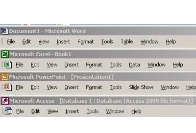
File, Edit, View, Insert, Tools, Window, Help — the common top-level menu of Office applications after a decade of organization and design battles
In this and the next five sections, the story of Office12 (Office 2007) unfolds. This is really the story of the development of the new user interface for Office, which became known as the Ribbon. To many readers, this will seem much smaller today than it was at the time, and that is understandable. I hope to put this work in the context of the day so readers can see just how big a deal this was. The graphical interface was the paradigm of computing. The menu bar was the manifestation of that. The addition of graphical buttons or toolbars was a significant advance and clearly the biggest addition to the WIMP paradigm.
One of the realities about a common toolset is that over time all applications get commoditized or at least appear the same. Everything looked like a big collection of buttons. That means two tools in the same category (two spreadsheets) will converge in how they look, and to the market they will be perceived as interchangeable. This perceived commoditization is one half of the story of Office12. The other half is figuring out how to make our extremely sophisticated products usable to hundreds of millions of people, something without precedent. A car typically has a dozen controls one needs to know to use it. Microwaves, televisions, thermostats, and so on are usually less than that.
Regardless of the reason, Office has thousands of commands. Making sense of those is an impossible customer task. So, what did we do? This section is an overview of the specifics of bloat. The next section presents some history, and then the design over the remaining sections.
Back to 076. Chasing The Low-End Product [Ch. XI. Betting Big to Fend Off Commoditization]
In 2001, Jon Stewart, the legendary host of The Daily Show on Comedy Central, performed a hilarious and brutal takedown of a redesign of CNN’s Headline News show. In the segment, he took to task the departure from the traditional talking head, as epitomized by Walter Cronkite and the evening news (and Jon Stewart). He mocked Generation Y (eventually called Millennials) for favoring a seeming onslaught of disparate information at once rather than one camera and a single story at a time. Stewart referred to a new look that “ . . . offers a great way to find out everything without the pressure of retaining anything.”
The punchline, almost 20 years later, is that the redesign Stewart mocked became standard across every medium, web, broadcast, cable, Bloomberg, YouTube, and today’s phone apps. We can bemoan such a change or accept the fact that people prefer consuming information differently than they did a generation earlier. The reality back in 2001 was that people were leaving TV news in droves in favor of on-demand, concise, and always available internet-based news displayed on crowded home pages.
Around the same time, the TV show 24 was considered both a breakthrough and critically panned for a similar departure from the tradition. The show was fast paced, had a complex narrative, and featured dozens of characters moving in and out of each other’s story lines. Critics said the narrative was overly complex. The same generational change was afoot, and the MTV Generation was raised on fast-paced video, clipped dialog, and rapid cutting between scenes. To this new audience, 24 seemed entirely consumable. The single-camera sitcom was in its twilight.
Design, whether functional or aesthetic, is a product of the context of the times. When contexts change—meaning the people and their needs and the available tools and technologies—designs need to change as well.
File, Edit, View, Insert, Tools, Window, Help.
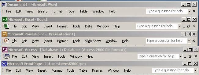
Like the catchy lyrics to a well-worn pop song, in Office we knew the top-level menus appearing consistently in each of the applications. We spent almost 10 years convincing, cajoling, and aligning each other around these words as though they were carved in stone. In fact, these words were the product of compromise—first a compromise between Microsoft and Apple on the original Macintosh applications and then a compromise between our new Windows applications and Macintosh versions. Finally, there was a compromise across Office to reach consistency. As with many compromises, no one was particularly happy with the result and there were plenty of exceptions, but nobody was all that unhappy either.
It wasn’t perfect, but it was our menu structure and our customers liked it. So much so, it was widely emulated across the industry. That made it carved in stone. It was like so many arbitrary design choices that somehow develop a lore of great design, like QWERTY keyboards or P-R-N-D in a car.
While rather adaptable creatures, humans tend to react poorly to change imposed upon them—a new stoplight, a new layout for a website, or the most heinous of all modern changes, a new software user interface for an existing product. Unexpected or imposed changes are viewed at best as arbitrary and at worst as bad (incredibly bad). It is exceedingly rare in the world of software to see existing users embrace major changes to mature products.
Consider something that most of us would today think of as rather benign, a change in the layout and typography of a print-based magazine. Magazines would devote a few pages explaining the design and rationale or perhaps even TV commercials as The Economist did with their 2001 redesign. Such “bold” (they always called them bold) redesigns would often become the subject of weeks of letters to the editor complaining about the failings of the effort and calling for a return to the old design, followed by the inevitable subscription cancellations.
Even if a product makes it through a big change, there often remains an undercurrent harkening back to the good old days for a long time. Whether it is simply conservatism or as some express a true loss of efficiency or effectiveness with a product, change is hardly ever free of controversy.
Yet, we live in a constant state of change. What is it that separates the changes that cause an uproar from the changes that happen with little notice? Technology is changing all around. Consumer behavior and work norms are regularly evolving. Competitors with new perspectives arise frequently. Often competitors with a fancy new design might even compete directly with a small portion of a larger established product with a tired design. Perhaps the new product even garners outsized attention because of that new design, less so than the features it brings. Failing to change remains the biggest mistake technology companies can make.
And as I’d soon learn, failing to change correctly is the second biggest mistake technology companies make. There are no rule books or guidelines that govern how much a product can change and when. There are many books telling you if you don’t change, you’re doomed. There are also a lot of books telling stories of changes going haywire. (Note to readers, this work is both of those).
Office became a bit like the old evening news, not so much Cronkite’s CBS but more like CNN. It was ubiquitous. It was reliable and predictable. It did not draw much attention to itself. Younger people knew about it but didn’t talk about it the way older people did. It was comfortable.
Still, each release was more successful financially than the previous and rated higher in customer satisfaction. Our customer base grew, and they continued to be happier with each release. The Office brand anchored several important traits of Microsoft representing “easy to use” and “professional.”
But comments about bloat continued unabated. Was it insider talk? Were people overall happy and the beltway of tech journalism was searching for something, anything at all, to criticize in the face of success? How could customers be so satisfied, and the business be growing if we were making increasingly bloated products? We theorized that analysts, reviewers, and reporters, those most typically calling out bloat, were users of a small subset of Office compared to typical knowledge workers. One reviewer of a major national outlet would not review Excel because of the view that most people didn’t need a spreadsheet.
As we discussed in creating Office Lite, a pervasive view existed that the product suffered in usability and quality because it had too many features. Specifically, there were too many features for how any individual said they used the product. Too many features lead to a complex experience and bugs, so went the theory.
Another theory was that PCs, not just Office, were becoming increasingly fragile and flaky. Bloat might be a PC problem and the ubiquity of Office simply an easy way to express the problem.
Three factors contributed to a feeling of a declining PC experience—sort of like a car that needed a tune-up to get rid of the engine noises, reduce the squishiness in the ride, and improve performance.
First, PCs were decreasingly interesting to purchase. The newest and best PCs lacked the excitement, and budget, that made consumers want to rush out to buy a new one. The pace of improvement in hardware arguably slowed, but so did the pace of software. By 2004, we were three years into Windows XP with no new release of Windows in sight. Longhorn was perennially under development. Without a new Windows, the need for a new PC was minimal and certainly not worth the pain of moving files and programs to a new computer. It is important to note that buying a new PC was the fastest way to reset the PC experience, cleaning out all the gunk. Without a PC purchase, such a spring cleaning was technically impossible.
Second, the rise of the internet turned everyone into a software downloader. Every first Tuesday of the month Microsoft sent updates to hundreds of millions of PCs to keep them secure—product changes that closed holes that could be exploited by malware and viruses. The creation of Patch Tuesday, as it was called colloquially, was rooted in Trustworthy Computing and was a major innovation in system security and reliability. The seemingly constant stream of product updates only served to emphasize the fragility of the PC. The required and poorly timed reboots wasted time or worse and left a bad impression of PC reliability while also providing great explanations for a PC slowing down or failing to restart.
Users were downloading software constantly as well. It wasn’t only the next version of a browser that remained interesting but the latest media player software, software to control the newest device to plug into a PC, utilities making the aging Windows XP easier to use, and more. From Napster to BitTorrent to Adobe Acrobat, plus an onslaught of games, there was an endless stream of software to download. Software installed on Windows had free reign over the system. Installed software could interfere with performance, memory usage, battery life, or even conflict with other previously installed programs causing all sorts of mysterious problems.
Tech enthusiasts had names for these problems. DLL hell referenced programs that failed to run if the wrong version of a file known as a DLL existed on the PC. Bit rot was the slow decay of the overall system. My favorite was registry corruption which was a mostly meaningless term referring to the slowing performance and potential fragility of a specific part of the operating system due to adding too many programs with too many settings. These conditions led to a new class of software designed to clean PCs, freshen them up, and recondition them. But these utilities only further exacerbated any problems and served to reinforce and accelerate the problems that PCs faced over time.
Finally, PCs in the enterprise were locked down by system administrators with an arsenal of software to secure the machines. These included firewalls, antivirus, virtual private networking (VPN), not to mention intrusive scans and analyses of the PC, slowing down every work session, especially just logging on. The fragility and risk to typical users on PCs created the need for more software, ever more invasive software, to mitigate those risks.
A typical office worker faced a choice of a lethargic PC at work with disabled capabilities or a PC at home that became increasingly flaky as members of a household continued to pile on an assortment of downloaded software.
As real as all of these were, none were relevant to Office which by and large was well-behaved. We needed to dig deeper. Bloat was our biggest competitive problem. Office still lacked a major competitor, but increasingly the cost and heft of Office were viewed as liabilities or targets. StarOffice was free and continued to be an annoyance. Piracy of older Office was far more of a competitor, and by virtue of its age was more fragile and prone to viruses and security problems thus worsening the perception of Office.
Startups were beginning to experiment with the latest browsers and the technology pioneered by Microsoft known as AJAX—a style of programming web pages so they behaved more like a typical Windows program with interactivity but with all the benefits of simply being a web page in a browser. Across the web there were startups building simple word processors and drawing programs this way, and even a few spreadsheets and presentation programs. Intuit (makers of Quicken) shipped a browser-based database to compete with Microsoft Access called QuickBase that won an editor’s choice for workgroup software. Microsoft invented AJAX for Outlook Web Access, but the depth of features made it useful for only occasional mail not the all-day transaction processing style of usage in Outlook. AJAX seemed far off for building a full-fledged productivity tool. Nevertheless, Office was investing heavily in making portions of the product browser-native, such as pivot tables in Excel and databases in Access, in addition to Word and PowerPoint documents.
The question in the air and among tech elites was chilling: Was Office finished and were the alternatives to Office good enough? This phrase good enough drove me crazy. It was as though there was something about productivity software that people should just settle for what gets enough of the job done today. Like a middle-aged person fighting off what seemed to be inevitable weight-gain was it slowing metabolism or was there actually a change in behavior? I used to ask rhetorically, “is Word (fill in the version) the peak achievement for humankind when it comes to writing?”
The snide comments about bloat were getting old.
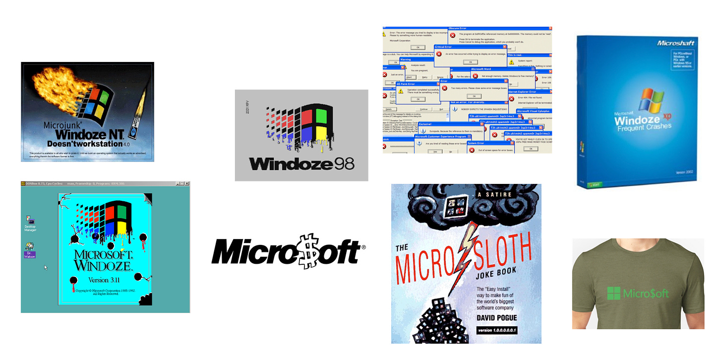
The internet only served to magnify what used to only surface in a review. Along with terms like MicroSloth, Micro$oft, and Windoze, every time a tech writer mentioned Office, positive or not, a chorus of bloatware filled the comments section or as we saw old fashioned letters to the editor.
Bloat was an amorphous concept with numerous manifestations. We needed to get to some actionable definition if we were to make progress—the heart and soul of the brand was at stake.
In spite of bloat, we heard endless requests for new features. At one point we compiled the most recent requests and something like 90% of them were features already in the product. Ouch.
What really got under our collective skin was the constant whine that Office had too many features, most of them unused. We worked hard on all those features and every one of them was traced to solving some problem customers asked about. At least that is what we’d tell ourselves.
This bugged us because the data was entirely conclusive: Most of Office was used. But no one person used the entire product. As if to emphasize this point, most people didn’t know or care what buttons they clicked on or menus they chose so long as it was working for them—and that meant when asked, “Did you use X?” most people couldn’t recall. To a skeptical press or IT manager (and they all were) that meant unused features.
![Too Much of a Good Thing? Identifying and Resolving Bloat in the User Interface: A CHI 98 Workshop Leah Kaufman and Brad Weed Introduction Qpening Exercise Aspects of Bloat Feature richness Not obvious how to accomplish a task Unnecessary information Visual Clutter Misuse of Color and Design Elements Physical constraints of the context Too many widgets? System fragility. Excessive learning time Why does Bloat happen? Presentations Projected Research References About the Authors Addresses Introduction Computer industry criticisms of 'bloat' are not a new occurrence. Typically, users and pundits alike complain about how slowly applications load and run or the amount of RAM required to run a single, let alone multiple, programs. In recent years, however, we've seen additional criticism of bloat in the software interface design and the sheer number of features built into products. A 1992 critique [1] stated that: "Maybe we've been blitzed by too many kitchen-sink demos. But we do notice a troublesome trend: A lot of new GUI products have become really, really hard to figure out. We keep seeing screens buried in layer upon layer of dialog boxes and windows, cluttered with randomly placed icons, file directories, pick lists, radio buttons, data entry fields, and other graphical furniture Blame for this bloat in the interface layout and controls is usually attributed to a steady increase in the functions and features built into each new version of software products. As MS-NBC columnist Joan Connell explicitly stated: "In 1992, there were 311 commands in the word-processing program I use to write this column. In 1995 it took 647 commands to arrange sentences and paragraphs, check spelling and do all the other mysterious things necessary to transmute human thought to a computer and deliver it to whoever wishes to read. And today, Microsoft Word has become so adept a human helper that there now are 1,016 commands required to accomplish roughly the same task. What impact does this sheer increase in number of functions have on users trying to do their work? How does it affect the visual design and layout of the interface? Is the problem perceptual and due to poor visual design? Or is it conceptual and rooted in an overabundance of features? We've reached a point in the software industry where its important to understand the source of this problem, it's effect on users, and figure out how it might be resolved. This workshop brought together usability researchers and interface designers to jointly examine the problem of feature bloat in software. Through discussion, presentations, shared insights and experience with interface design, testing, and use, we worked towards a clear understanding of this issue and recommendations for addressing and studying it. Too Much of a Good Thing? Identifying and Resolving Bloat in the User Interface: A CHI 98 Workshop Leah Kaufman and Brad Weed Introduction Qpening Exercise Aspects of Bloat Feature richness Not obvious how to accomplish a task Unnecessary information Visual Clutter Misuse of Color and Design Elements Physical constraints of the context Too many widgets? System fragility. Excessive learning time Why does Bloat happen? Presentations Projected Research References About the Authors Addresses Introduction Computer industry criticisms of 'bloat' are not a new occurrence. Typically, users and pundits alike complain about how slowly applications load and run or the amount of RAM required to run a single, let alone multiple, programs. In recent years, however, we've seen additional criticism of bloat in the software interface design and the sheer number of features built into products. A 1992 critique [1] stated that: "Maybe we've been blitzed by too many kitchen-sink demos. But we do notice a troublesome trend: A lot of new GUI products have become really, really hard to figure out. We keep seeing screens buried in layer upon layer of dialog boxes and windows, cluttered with randomly placed icons, file directories, pick lists, radio buttons, data entry fields, and other graphical furniture Blame for this bloat in the interface layout and controls is usually attributed to a steady increase in the functions and features built into each new version of software products. As MS-NBC columnist Joan Connell explicitly stated: "In 1992, there were 311 commands in the word-processing program I use to write this column. In 1995 it took 647 commands to arrange sentences and paragraphs, check spelling and do all the other mysterious things necessary to transmute human thought to a computer and deliver it to whoever wishes to read. And today, Microsoft Word has become so adept a human helper that there now are 1,016 commands required to accomplish roughly the same task. What impact does this sheer increase in number of functions have on users trying to do their work? How does it affect the visual design and layout of the interface? Is the problem perceptual and due to poor visual design? Or is it conceptual and rooted in an overabundance of features? We've reached a point in the software industry where its important to understand the source of this problem, it's effect on users, and figure out how it might be resolved. This workshop brought together usability researchers and interface designers to jointly examine the problem of feature bloat in software. Through discussion, presentations, shared insights and experience with interface design, testing, and use, we worked towards a clear understanding of this issue and recommendations for addressing and studying it.](https://substackcdn.com/image/fetch/w_1456,c_limit,f_auto,q_auto:good,fl_progressive:steep/https%3A%2F%2Fbucketeer-e05bbc84-baa3-437e-9518-adb32be77984.s3.amazonaws.com%2Fpublic%2Fimages%2Fb20e5c40-cde0-4b8d-a82e-d89892d1eb80_1732x2012.png)
We measured usage for a decade, first with the laborious and entirely manual process of the instrumented version described earlier. With the arrival of the internet and Watson technology, we extended the instrumented product to every Office customer, everywhere. Enabling the telemetry of the product was via opt-in only, totally anonymous, and no identifiable information was collected. Several data points were recorded: what commands were used; if a command was invoked by a keyboard shortcut, menu, or toolbar; how long an operation took; and, importantly, what sequences of commands were executed. Things we guessed at 15 years earlier were knowable in what could be called a census of usage. While some people didn’t opt in, a large enough majority of users (meaning an unbiased and large sample of the population) provided us with data upon which to decide how to evolve the product.
We called the extensions of Watson (previously used for crashes and system hangs) to usage data Software Quality Monitoring (SQM), or “skwim.” SQM was the buzz of the hallway and became the linqua franca of the program management team. SQM was how we settled debates over who used what, how much, and what was most important. The insights gained from SQM were as exhaustive as the volumes of charts, tables, and graphs that filled our collective inboxes.
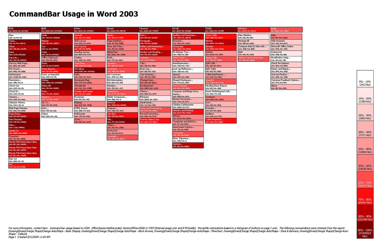
Decades later, the idea of using data to design products is a well-understood approach. At the turn of the millennium, it was new and radical, and a strategic advantage. We focused on using data to figure out how to get things done faster and with fewer clicks. Web sites were using data to figure out how to get people to buy more online, read certain articles, or to click on advertisements. Here we were using data to help people use the product less.
What we were learning with SQM, however, was that people were futzing a great deal with Office. While the most common commands were the obvious (Print, Save, Copy, Paste, Bold, and a few others), with astonishing frequency users were hitting Undo, Redo, Undo sequences trying to figure out how something might work. Seemingly common operations like creating a chart in Excel or a table in Word were tiresome and endless sequences of trial and error. A trivial task in PowerPoint, such as aligning two shapes in a drawing, was done by nudging with arrow keys and eyeing the result, rather than using the built-in alignment tools that were a few (too many) clicks away.
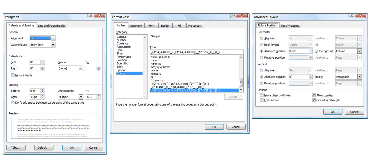
We called the futzing document debugging, and it created a frustration that the product was powerful yet overwhelming. People believed a specific result was achievable but getting from point A to B seemed impossible or unlearnable. The idea that documents were being debugged mirrored the complex dialog boxes for adjusting formatting. These user interface elements had incredible series of buttons, measurements, and options available with no indication of what to use when. The picture positioning dialog in Word featured a dizzying array of horizonal and vertical alignments with many options always greyed out, and no simple way to indicate a desire to stop moving everything around so much.
There were routine offenders like trying to fix the spacing between paragraphs or position an image in Word, or the impossibility of altering a chart in Excel. The mere mention of bullets and numbering would be followed invariably by a groan. Arguably, the worst offenders were the infrequently used idioms: creating labels used for holiday cards or the one time when a table called for alternating bands of shading in rows or columns. Inevitably, a person sat there looking at the screen trying to recall how they did it the year before.
None of this was new. A decade earlier, I was taking notes at a planning offsite with the Systems team. The laptop I was using was connected to a projector so everyone on the team could see the notes. In a quick sequence of keys, I created a blank page, a heading, and then followed that with subcategories and bullets. I didn’t leave the keyboard. My breakout group watching me insisted on knowing what sorcery I conjured to create an outline in such a way. That was typical for anyone skilled in Office.
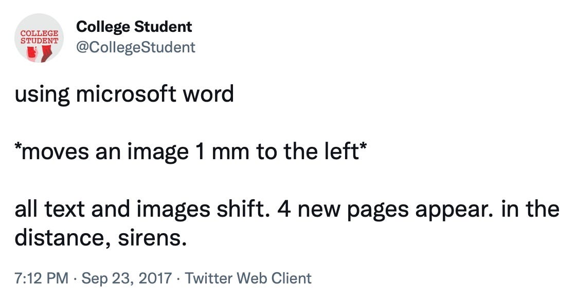
Every plane trip was a usability test opportunity for Office. Watching a seatmate analyze sales in Excel while simultaneously using a calculator was typical—and spectacularly difficult to watch. The daily work of using Office to create great-looking documents was filled with moments of, “If I could only figure out how.” A common task for many, something like a product description page with a photo with text flowing, was impossibly confounding.
The specific user interface for these and other scenarios were an array of options, terms, and choices that are meaningless at best and destructive at worst. Even finding the right place to make a change was a leap in logic for typical users who did not have the benefit of software design expertise or the constraint of just trying to figure out where to squeeze it into the product. Offenders such as the paragraph formatting or picture layout in Word or the Excel cell format options appear to most people to have the same level of complexity seen in the cockpit of an airplane.
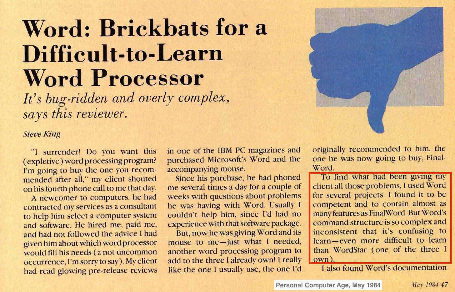
It was as painful for us as it was for customers. We sincerely believed we made things easier over the years. We had come a long way since the first reviews of Word 1.0 for MS-DOS that called it “difficult to use.” We came to realize that after a decade, our user interface mapped directly to the implementation of the product—literally the data structures and structure of the code—and not to the results that a person was aiming to achieve. This was incredibly important for us to internalize.
It was not as though we were the first people to stumble upon the idea of making computers easy to use. It was more that after a good run of nearly two decades of trying to make products using a graphical interface easier, we needed a new approach. The irony was that the graphical interface itself, with its friendly mouse and menus, was supposed to finally make computers easier to use. Instead, more features and capabilities went underutilized and over time no one was around to remember just how impossible to use early software really was.
The earliest days of the graphical interface and the pioneering belief of Office was that consistency was the fastest path to easy. This was especially the case because Office was rooted in a collection of historically different applications. If a customer invested the time in learning one module of Office, then consistency made it easier to learn the next, and the one after that. An entire generation of reviews and industry analysis (and even my competitive analysis of Lotus SmartSuite) dove deep into consistency as a positive benefit. When computers were new to the world, it might have been that consistency felt safe and easy. Even IBM documented a consistent interface for the OS/2 operating system called common user access (CUA) that was to span mainframes to PCs, with a rack of design books for developers to follow (they did not).
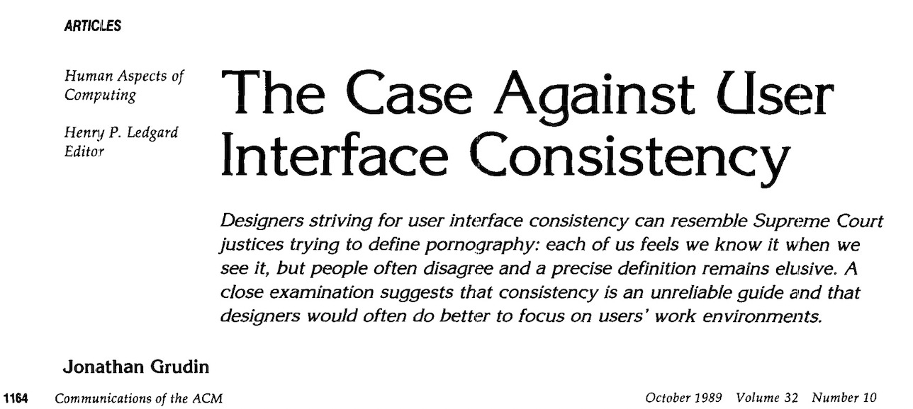
The internet changed this for everyone by being wildly inconsistent. The web quickly evolved to a cacophony of user interfaces. The text and pictures, with blue links to navigate to the web, transformed into an environment as diverse as a stack of Gen-X magazines. The important lesson for us was that people didn’t notice. Yes, there were sites that were difficult and sites that were easy, but people adapted to adapting. No powers were calling for a standard interface for the internet. As the essayist Ralph Waldo Emerson said, a “foolish consistency is the hobgoblin of little minds.” This saying was used in an influential academic paper on the pros and cons of user interface consistency that appeared in 1989. Several times as a program manager I made copies of this paper and distributed it.
While the Office Assistant was the last major attempt and failure to make software easier, by Office 2003 the product was filled with a series of widgets and affordances designed to surface features in a more helpful manner. Office became a stage for every designer and program manager idea to make things easier at a micro-level, one addition at a time. What started off as something simple, like keyboard shortcuts and dialog boxes, ballooned into context menus, wizards, panes, and toolbars, all customizable, floating, docking, and resizable. The next section will detail some of this history.
Bloat wasn’t that products did too much. The marginal cost—in dollars, memory, disk space, or vague notions of complexity—was not bloat. We tried reducing bloat by hiding features as discussed previously, but that only added to the mystery of the product. Mac, Windows, and Office all went through periods of “simple means fewer” and tried mechanisms such as short menus, simple mode, or adaptive toolbars. But that frustrated or confused people. No one really wanted to use a simple mode and there was always one command missing that was needed, so simple mode became a complicated way to do that one thing that made someone’s work unique.
We began to consider that bloat was the inability to feel mastery of a product, knowing that the product was capable of something while seemingly impossible to figure out how to make it do that something.
Two important lessons from the product planning and research team solidified our collective view of bloat and formed the foundation of designs.
The first lesson emerged from sifting through usage data. Cameron Turner (CameronT) and others studied the depth and breadth of usage of PCs (how many programs, how often) and also features within Office (what features were used). CameronT was an early PowerPoint program manager hired from Stanford who later left Microsoft to start a company focused on analyzing software usage (long before data science was a hot topic).
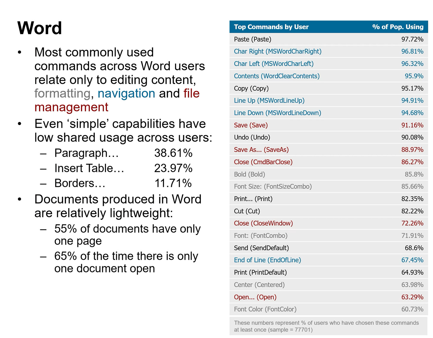
Watson crash reports trained the team well to work with the 80/20 rule, and Cameron applied this same analysis to features and commands used across Office programs. Looking at features used by everyone (those who opted-in to anonymous telemetry), 80 percent of the users shared only two commands, Copy and Paste. Said a different way, Copy and Paste were the only commands used by 80 percent of users. In other words, even at the most basic level people used the products in different ways, which was counterintuitive for most observers. At the same time, there were many commands that most people used such as Copy, Paste, Save, and Print. Even then, some commands were not used by even a majority of users, such as Open from the File menu, indicating that a good deal of work happened by opening email attachments or from folders on the desktop. When critics generalized about feature usage in Office, we learned they were almost always wrong.
Importantly, and also counterintuitively, nearly all the commands in the product were used by at least someone somewhere. There was not a lot of dead weight in the product, even accounting for accidental usage or the random case where it was clear a given customer was trying every single thing.

The histogram of usage was steep. There was a small set of commands that represented 80 percent or more clicks and a long Pareto tail for the thousands of other commands.
This second point was obvious to those on the front lines with customers—technical account managers, customer support, and our own sustained engineering teams. Routinely we saw what most would call esoteric use.
The breadth of usage was a major selling point of the product as well. At the high level, while someone might not create a spreadsheet model, that same person might receive one in email. At a deeper level, most in a company might not use a feature such as Track Changes (or Redlining) in Word. But their lawyer would. And contracts or legal letters might arrive via email for review. Rarely used features became part of the work of others. This network of usage was a key advantage of Office and a significant reason behind our ability to win corporate-wide enterprise agreements.
Just as the crash data became an obsession with development and testing, the SQM usage data became an obsession with the designers of our products. In fact, developers also loved SQM data. It gave them a way to push back on program management when they thought spending energy on a feature was a low-yield effort.
The second lesson was about how an individual experienced Office. In parallel, Tim Briggs (TBriggs) was one of the early user researchers to join the Office research team. He began to employ (then) sophisticated eye-tracking studies with volunteer test subjects in our labs. In eye-tracking studies, the test subjects sat in front of a PC and performed a series of typical scenarios. Special cameras were trained on their eyes monitoring where on the screen they looked. A program manager or designer watching the test saw a typical PC screen with Word or Excel running and a little dot flying around the screen representing the subject’s eye focus. The test software drew tracking lines, like a route across the screen, and compiled statistics on the amount of movement, total gaze time, or even how much a subject seemed to look around trying to find something—rocket science at the time.
The results of this technique on Office 2003 were shocking. For basic tasks, if people did not know what to do, they scanned the entire screen in a seemingly random pattern, often for many seconds. They played hide-and-seek with menus and toolbars as they searched for something. The test software generated a heat map, a color-coded view of the computer screen showing where the subject looked most frequently—deep red for the hot areas looked at the most all the way to blue where subjects looked the least. The Office 2003 screen looked like a sea of solid red across the main toolbars and menus. Our test subjects looked everywhere for a long time.
The user interface carefully crafted over a decade was in no way helpful. It was bloated.
Ages ago in ancient Microsoft history there was a debate on the original apps team about what it means for something to be a bug. Is it a crash? Is it data loss? Is it a typo in an error message and so on? Out of that was created a notion of bug severity, a measure for how serious a bug might be from losing all data all the way to simple cosmetic issues. However, when it came to talking about bugs with product support or ultimately customers the definition of a bug was very simple “a bug is any time the software does not do what a customer expects”. This definition created a discipline of documenting everything reported about the product and always making sure every issue was looked at, even if a code change did not result. The key lesson was how helpful an expansive definition was.
In past experiences with bloat, we only focused on two measures. First, we tried to reduce the user interface surface area by simply hiding commands behind context menus or full/short menus or even toolbars to some degree. Second, we spent countless cycles reducing the amount of disk space and memory consumed by Office to reduce the notion that Office was big or slow.
These are both bloat but that is a narrow and technical definition, one that is engineering focused and not particularly useful to customers. It didn’t really matter if the product used too much memory or disk space, as those seemed like symptoms of the whole computing experience.
In the eyes of customers in practice, bloat comes from the fact (using that word on purpose) that Office does so many things that customers just assume the product can do whatever they need it to do. Despite that fact, customers have no idea how to make the product do what they need. This feeling of helplessness that leads to frustration is what it means to deliver a bloated product. It did not matter how many ease-of-use features we added, all that did was compound the problem of too many placers to click. What good is a new wizard or task pane if a person has no idea how to access that or if accessing it will yield the desired result.
Bloat is owning a product that you cannot master. No one felt they could master Office.
How is it that Office managed to get to this point and when did it become a problem?



"...something like 90% of them were features already in the product." I encountered this myself just this week.
Someone sent me a Word document they had made changes to. They did not use Track Changes/Insert Comment, nor did they use the age old method of using a different font color for changes and making comments by adding text in brackets or italics, prepended with their initials like Outlook does.
I wasn't looking forward to manually comparing the two documents. I was sure there would be a 3rd party add-in somewhere that could do this for me, but I really didn't want to go down that rabbit hole. I discussed it with a colleague who said, "I don't think Word has that function built-in." Neither did I, but I decided to search online anyway just to see and...it does! Adding insult to injury, it's only a few icons to the right of Track Changes. Despite having used Word since Word 95 and using WordPerfect for DOS prior, I had never noticed it because I never needed it, and never went looking for it. Previously when sharing documents, people had used Track Changes or some type of homegrown method like I mentioned earlier.
I have no idea how long that function has been in Word, but it's there and worked perfectly.
This is an amazing account and I look forward to the successive discussion. Meanwhile, highlights for me.
“A bug is any time the software does not do what a customer expects”. Amen. A thousand times Amen. And getting an incident report is valuable information, not something to be deflected to a Forum, Discord, or elsewhere.
(Aside: I was and remain a big fan of CUA. That's how retro I am.)
"Our user interface mapped directly to the implementation of the product—literally the data structures and structure of the code—and not to the results that a person was aiming to achieve. This was incredibly important for us to internalize." Yes, my mantra in walk-throughs and other situation is always, don't tell me the code, first tell me what it is for, and then tell me how the code accomplishes that. (Substitute whatever for "code.") At the UI/UX level, there's more abstraction than that of course. But always, what is it for? I find that Design Patterns can help but not the way they came into object-oriented software.
"It wasn’t perfect, but it was our menu structure and our customers liked it. So much so, it was widely emulated across the industry. That made it carved in stone." Ahah! The coin drops about supposed competitors for Office.
I just installed the latest release, Apache OpenOffice 4.1.11 (x86 only, clumsy installer). There it is, &File, &Edit, &View, &Insert, F&ormat, T&able, &Tools, &Window and &Help. Grabbing the latest LibreOffice, 7.3.2.2 (x64 MSI installer), the Menu bar adds St&yles and Fo&rm. But it is hidden by default and a Tabbed view is there with the a clickable button to toggle appearance of the menu strip. The tabbed view is Ribbon-appearing (and described as such) but definitely not a ribbon, and not easy to collapse.
Now I understand the appeal of "competing" with Office 2000/2003. (There are still people who build Apache OpenOffice for OS/2 and those like me who owns a car until his feet go through the floorboards.) So it is free, it runs on Linux desktops (and is in distros), and it offers some sort of interoperability with simple-enough Microsoft Office documents. The 80-20 rule says forget-about-it and that has held up. Amazing. As much as Sun/Oracle/IBM wanted a different outcome (or at least a distraction for Microsoft), here it is.