035. Windows 95, August or Bust [Ch. VI]
Overall performance is sluggish, tasks throughout suite applications are more complex to perform than in previous versions. —PC Week, Aug 21, 1995
1994 to 1995: Sharing code and processes to build Office pays off and the concept of the suite takes hold in the market. The Windows schedule becomes a death march to finish what is hoped to be a revolutionary new operating system. Netscape IPOs in the summer of 1995, weeks before the public availability of Windows 95.
This is the first of five sections in this chapter on building Office 95.
Back to 034. Office 94, 96
Office94 had a plan in place, with a date and resources, as well as the major architectural bets of 32-bits and suite. There was so much focus on getting started and the resource constraints so extreme that, while this was the first release of an Office product, it would also be the last release for which the planning was fully distributed to each team with little centralized effort.
The organization was set with a feature team for each product and one in OPU. For the most part, the feature team leads were running this project, at least from the start, as the more senior leaders were supposed to focus more on Office96. Putting in place the plan for Office96 happened in parallel with a different set of people and a lot more attention from the BUMs. Unless there was something specifically troubling, for the most part Office94 was flying under the radar of DAD and had almost a skunkworks feel to it, at least at the start. That did not last long, for me.
As the new PM leader in Office, I was wearing two hats juggling both releases—in hindsight the first 12 months in Office were probably the time I put in the most hours working as I was learning how to manage managers for the first time, not to mention learning the DAD ways of working.
While I was juggling, among our team of about 15 program managers Mike Conte (MikeCon) was the primary program manager on OPU driving Office94. Mike joined the Excel team after experience running his own Macintosh startup. On Excel, he was a key to Excel gaining adoption at large customers, especially banks. A true New Yorker, Mike wore all black and had a no-nonsense attitude. He laid the groundwork for the release, but early on moved to a new role on the Windows team. He easily transitioned the release work to Heikki Kanerva (HeikkiK). Products had a formal management team that was ultimately accountable, but each release saw people step up and take on the informal leadership required for complex cross-group work. This was Heikki’s release to step up.
Heikki was a Finnish Olympic-caliber skier who found his way to Microsoft by studying business and computer science on a scholarship to the University of Alaska, after mandatory Finnish military service on a submarine. He joined DAD in the shared interoperability group and cut his teeth on shipping the enormously complex OLE technology. As it turned out, Heikki had absolutely the perfect demeanor to lead all of the teams through shipping the first synchronous release of Office. He was unflappable and possessed a military precision and the dedicated work ethic of an Olympian. And when needed, he could make light of a situation with a Finnish submariner expression that did not translate well at all into business English or, frankly, polite company.
Heikki led the newly formed Office-wide project meetings—the first time that key managers across all the apps assembled routinely to make progress on work. These meetings started off weekly and then as milestones approached, daily and then twice daily. While this was only a few people at the beginning, it was the organizational and cultural shift required to begin to operate as a suite, not as a bundle. These meetings became the operating heartbeat of the team, not a tax while the real work happened elsewhere.
I know it seems ridiculous to mention that we scheduled a weekly meeting for a new project, but up until this point creating Office essentially flew under the radar without an operational motion.
From an engineering perspective, the move to 32-bits was fairly smooth especially since much of the work had been done earlier in the side projects of making native apps for Windows NT as proofs of concept (and to make them available for sale). From a practical perspective, however, the transition to 32-bits hit Microsoft where it cared the most, performance. If there was one thing deep in the culture of the company, it was squeezing the most out of the scarce compute resources of CPU and memory. The move to 32-bits was inevitable, but the impact on performance was counter-intuitive.
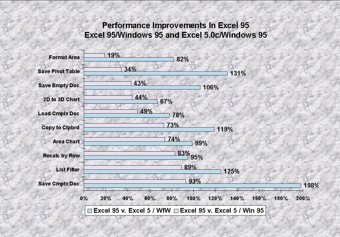
In moving all the apps to 32-bits, no surprise but all the code got twice as big. And much of the data stored in memory got twice as big. Moving all that around made things slower. Crazy. For Office, 32-bits didn’t mean very much—Word already handled long documents, and spreadsheets could be pretty big. These products grew up in extremely limited memory. In fact, many of our own tests were showing that the 16-bit versions of apps performed better on Windows 3.1 and were even a bit slower on Chicago. That’s because Chicago was also going through this widening experience with the operating system code. Everything was expanding. Except the system requirements, the amount of memory a PC required for Chicago and Office as printed on the box.
It didn’t take long for fingers to start pointing. That’s natural. The real issue was not necessarily the benchmarks which over time would tend to work themselves out (we hoped) but just how much memory was required to get reasonable performance. The key market promise for Chicago was that customers could upgrade their Windows 3 systems to Chicago and things would get better, but if those systems had only 4MB of memory or yikes 2MB then these systems would be horribly slow, and even more so if they also upgraded Office.
PCs were not only expensive in the 1990s, but they were also treated as capital expenses by companies. They had 5-year lifecycles, amortization schedules, and an expectation that the software could change over time without expensive and very difficult or impossible to implement hardware upgrades. Upgrading memory required a day or more of downtime, a “truck to roll” with a tech, and probably hundreds of dollars of hardware.

There was not much we could do about this but continue to work to reduce memory usage. There were some significant efforts in tools and analysis and some amazing work across Windows and Office to make things work on 4MB, but ultimately 8MB was “recommended” (versus “required”). This fell short of the 2MB Windows 3 required. As it would turn out, doubling the system requirements for each release of Windows became the norm as I would point out in about 12 years when we launched Windows 7. Office trended remarkably well and for many releases, the typical Office application (Word, Excel, PowerPoint) did not substantially increase requirements of about 2-4MB per application on top of the OS.1

While reviewers and people in stores immediately noticed the system requirements as that was often the first aspect of a new release to check out, the main feature visible to people using Office would be long file names. In hindsight, it is hard to believe that for the first 15 years of MS-DOS computing, human beings tolerated naming their work with cryptic 8-character names. Still, Microsoft email names continued to be 8 characters.
Dealing with these 8.3-character names forced people to create all sorts of algorithms for naming files. While the convention was that the three characters after the period would determine which product created the file, there was nothing in MS-DOS (or subsequently Windows or Chicago) that required that (an area where Macintosh continues to be better, even to this day). As a result, companies created rules for how files should be named. For example, all the reports for the fourth quarter might be BUDGET.Q4, DETAILS.Q4, SUMMARY.Q4 for the spreadsheet, word file, and presentation instead of the default .XLS, .DOC, and .PPT. Chicago was moving to a model where the final characters of the name, the creating program, was hidden in the interface as had been done on the Macintosh from the start.
Even though such a change was long requested or desired, as with everything Microsoft did the pain of the installed base and embedded resistance to change always seemed to make a showing. A major bank once sent me a long feedback memo explaining how the pre-release test of Office for Chicago made their convention difficult to use and considered it a “showstopper” bug—long file names broke how they sorted all their quarterly documents in folders. A showstopper was a bug believed to be so bad that a product could not ship, and in our case meant it would not be purchased. Being able to use hundreds of characters to name a file was at first viewed as a negative by some, despite being so liberating. The feature of not needing to worry about the last three characters of the name was a feature, or so we thought, not a bug as the customer thought. Ultimately people adjusted, but this served as a reminder of how difficult transitions are even when the benefit is readily apparent.
Between 32-bits and long file names we believed we had landed most of the critical features to support Chicago. There was a long list of small changes as well, which we often tagged in our RAID database with the source “TT” for “tiny and trivial.” As Chicago made more progress the list seemed to grow in scope. And everything that came up was viewed as a “Pri 1” (priority 1 in RAID) work item by the Windows team for Office to do. There was a strong belief that if Office did not implement something then no other developers would—and within Microsoft there was no confusion over who was driving the agenda.
As the schedule marched through 1994, it became clear that the features we were implementing to be more of a Chicago application were helping us to become more of a consistent suite. Even though we were struggling across the Apps and OPU to become consistent the even bigger stick of Windows made it possible to drive some features that we otherwise would not have done.
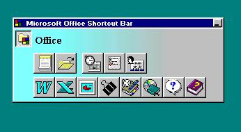
While not central to the product experience but very visible the Microsoft Office Manager (MOM), a tiny little bar of buttons that floated in the upper corner of the screen that enabled one to switch between apps with a single mouse click, was a surprisingly popular feature of 16-bit Office. This feature came about when a college-hire program manager, Dean Hachamovitch (DHach), quickly prototyped this solution to a common problem on Windows 3.x before there was a Start Menu or taskbar, and it proved so interesting that it was completed using contract developers and shipped with Office 4.x, becoming something of an early symbol of Office and later copied by Lotus—by demonstrating that Office was more than a bundle but a seamlessly integrated set of tools. With Chicago, this feature had dubious value because of the enhancements to the OS, but removing it was certain to be a customer pain point—it was common for IT to build lessons and documentation around features to be used in training, and every major change involved reworking such in-house curriculum.
A new Office program manager, David Tuniman (DavidTu), spent most of the release trying to devise a useful and appropriately strategic evolution of MOM. He was constantly running back and forth from building 17 to the old single-X Windows buildings to find some way to integrate and show off Chicago. Ultimately, he arrived at the Office Shortcut Bar, OSB, which did the same thing as MOM but took advantage of the new Chicago feature called shortcuts—and once again turned out to be rather popular with IT, much to our surprise (we know this because when we removed it from a future release we received a lot of complaints).
We worked across Windows and Office to build on the new capabilities of Chicago. That was the win-win. OSB was a feature that just kept expanding and adding a ton of complexity (and exposing a ton of issues in Chicago). Reviewers and customers were enamored with OSB even though in the end it almost entirely overlapped in capability with the Windows Start menu.
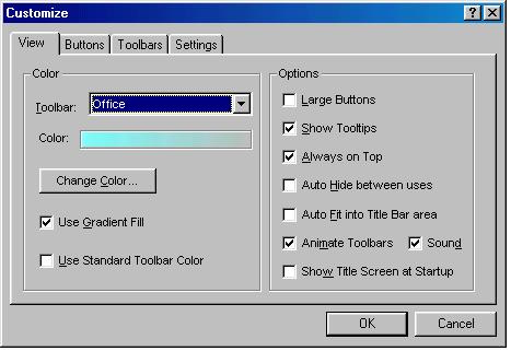
After the “work on Chicago” features, there were two major themes for the product release, though to be fair none of this was determined before the products were being built—the constraints of time and not changing the file format dictated what work could be done and the themes arose by packaging those ex post. The themes were consistency by showing off the suite and IntelliSense, or a doubling down on doing things automatically introduced in Office 4.
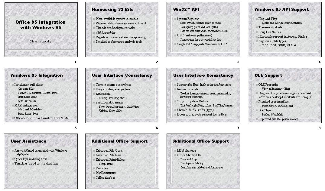
Extending AutoCorrect from Word 6.0 to Excel and PowerPoint marked some of the first shared user-interface and functionality across the suite, and keeping with the idea of making the Suite paramount for everyone the Word team took the lead while working with OPU on making this feature happen. This did not come without battles. As expected, Word had ideas for expanding the feature beyond Word 6.0, given how wildly popular it was. PowerPoint was fine with the feature but could have easily done without shared code. Of course the Excel team put up a fight because not only did they resist the shared code, but the whole concept of AutoCorrect legitimately scared the team—the potential to introduce errors as text was automatically inserted that was different than the person typed (by accident perhaps!) Persevering, the result was a shared AutoCorrect feature that was a subset of the new implementation in Word, but importantly the list of customized entries was shared across the product. In hindsight this seems so very small today, but monumental at the time. When we did the first all team demonstration it registered with a round of applause.
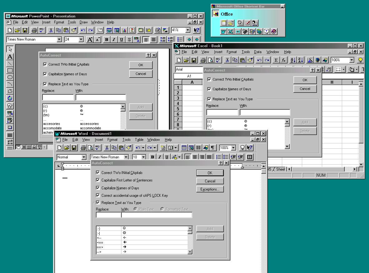
Consistency was something many had identified (including me with my memo on SmartSuite) and seemed relatively easy enough. But doing the work bumped up against how different the users of each product were, or so each product team liked to mention.
We did not embark on sharing a lot of new code to achieve user interface consistency and would save that for Office96. There were several initiatives that proved critical to market reception (and perception) as well as developing a suite muscle in program management. Importantly, the constraints pushed us to pick “high-value targets” for consistency.
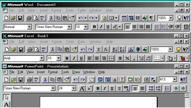
The most visible user interface in the products were the two main toolbars—the one with all the basic commands (file open/save, print, and clipboard) and the one with all the common formatting commands (bold, italic, center, etc.) For the most part, what goes on these toolbars was the result of studying people using the product and what resulting documents looked like (reverse engineering the commands used). While everyone might be different, the top commands are consistent enough that we could design toolbars to be the same. Right out of the box we had a big step forward in consistency. For example, Excel had tools for drawing borders and using the new Maps feature, Word would have some buttons for new IntelliSense features, and PowerPoint emphasized the ability to include content from Word and Excel in slides. In many ways, the choice of these buttons were the earliest days of today’s “growth hacking” as we primarily populated the toolbars with common features, but every once in a while included something new or strategic in hopes of driving awareness.
I am skipping a lot of steps. Achieving consistency in toolbars was a historic battle that took years and several releases to get us to even some marketable level of consistency in this release. Originally, even the icons used were points of pride across different applications. For example, Word originally chose a piggy bank icon for the Save. It was only after realizing that such an icon did not share the same meaning around the world that Save was immortalized as a now obsolete floppy disc. There was a debate over little text bubbles appearing above buttons providing a long description of the graphical button, called tooltips, should they be yellow or white, and how big? Excel and Word each had different ideas on using color in icons—was color useful, necessary, or a distraction would occupy program manager battles for a full product cycle. The teams could not agree on how many pixels toolbars should use, should they be 15 or 16 pixels? While seemingly nitpicking, the premier demonstration of Office 4 routinely showed off this disagreement when switching between Word and Excel and a little 1 pixel shift would cause the demo to jitter, intentionally so to speak. The newly formed OPU led the charge towards a consistent and unified experience starting with toolbars, but it did not end there.
If the toolbar was the most visible then the file open dialog was the most used dialog and also was horribly inconsistent across products. In the MS-DOS era, the experience of opening a file was viewed as primary competitive advantage and major topic in product reviews. The Mac made this relatively obsolete because apps used a file dialog provided in the Mac operating system. Interestingly, Windows did not have a common interface for this available to developers until Windows 3.11 so the idea of competing on this interface still existed. Windows 95 had built-in interfaces to use, but by then there was a challenge in that competitors to our apps were not using them and all apps needed more advanced capabilities. For any other vendor, the idea would be to win and not worry about what Windows was doing. For Office, what Windows was doing mattered, and we had a mandate to consistently use the Windows dialog and to win in reviews. Having the Windows feature pushed on us in such a critical area was annoying, especially with so few on Windows committed to helping us win competitively.
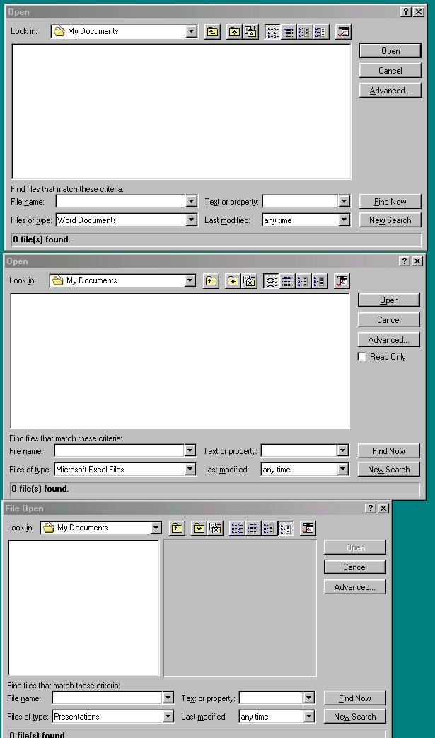
We created a separate team to create a superset of the existing experiences across Word, Excel, PowerPoint and then use the ability to customize the new Chicago File Open to build a robust and consistent File Open user interface. In addition, they would inadvertently create a small feature that would become one of the all-time great areas of complexity for Microsoft across Office, Windows, and Server—an accomplishment few small teams could match. The feature came about because WordPerfect had done a fantastic job with search for MS-DOS and was certainly going to bring it to Windows—and Chicago.
The team created a mechanism that indexed the files on a hard drive and made it easy to quickly retrieve files based on searching for content. We called this personal Lycos after the earliest internet search engine. For Office94, it was a small button in the new File Open dialog and a small utility program called Find Fast. When the PC was not being used, the program started up and read through files and built the index—this was a great way to make use of all the unused processing power of a Chicago PC. But it also became one of the first features that stressed the performance of early battery-powered Chicago laptops, with slow hard drives and limited memory.
The problem was twofold. First, people thought their PCs were possessed by demonic forces or, worse, a virus because the disk activity light popped on and the PC started making the grinding hard drive noise even when not being used. Second, laptops generally had about two hours of battery life at best and this reduced that even more. We were fast running into trouble with this feature, but at the same time we received tons of positive feedback from early users, especially reporters and writers where the feature worked best. Down the road this would cause more “trouble” because it was clearly something that Windows should have for all apps, not just Office, and Windows Server should do something to compete with Lycos. Things were newly getting started with this technology, and it would follow me all the way through to my time in Windows.
But we had a great and consistent File Open dialog with a new way to search for all the files gathering on ever-growing hard drives.
There was a lot more to the release. One thing we learned is that when you build a product out of a bundle, no matter how hard you sell the sum of the whole is greater than the parts, people want to see innovation in the parts. We also learned people like to see whole new parts of the bundle.
On to 036. Fancy Wizard and Red Squiggles
Here is a link to a collection of Windows system requirements from the box. https://www.technologytips.com/windows-system-requirements/


Fascinating discussion. As an end user, I remember being vaguely aware of these differences - even the subtle ones - but not understanding why they could not be the same.
BTW - the caption for the toolbar comparison screenshot has a couple of typos (Poowerpoint, persinal)
"While this was only a few people at the beginning, it was the organizational and cultural shift required to begin to operate as a suite, not as a bundle. These meetings became the operating heartbeat of the team, not a tax while the real work happened elsewhere."
Love this description of building a team.